Best Canva Font Pairings for Small Business Branding
Quick answer: useful Canva font pairings to try
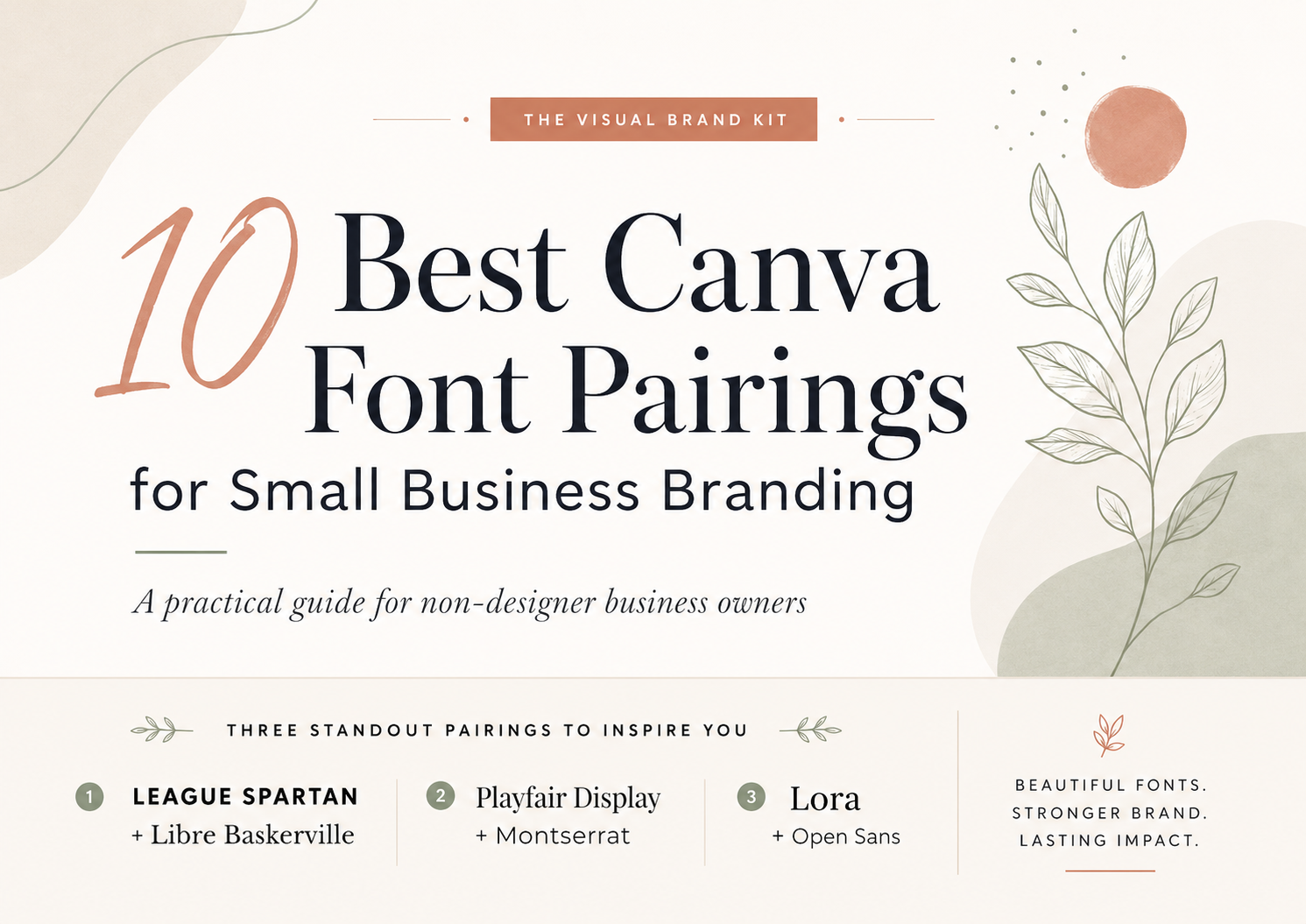
If you want a confident service-brand starting point, try League Spartan + Libre Baskerville first. For a more elegant beauty or wellness direction, start with Playfair Display + Montserrat. If readability in guides, PDFs, and client resources matters most, Lora + Open Sans is the safest first test. Use Yellowtail + Open Sans only when you need a small handmade-style accent, and choose Bebas Neue + Montserrat for short, bold marketing headlines.
The quick answer is to pick one heading font and one supporting font, then test that pairing in the real Canva layouts you use most often. A pairing should work on a small Pinterest pin, a lead magnet cover, and a practical business document before it becomes part of your brand system.
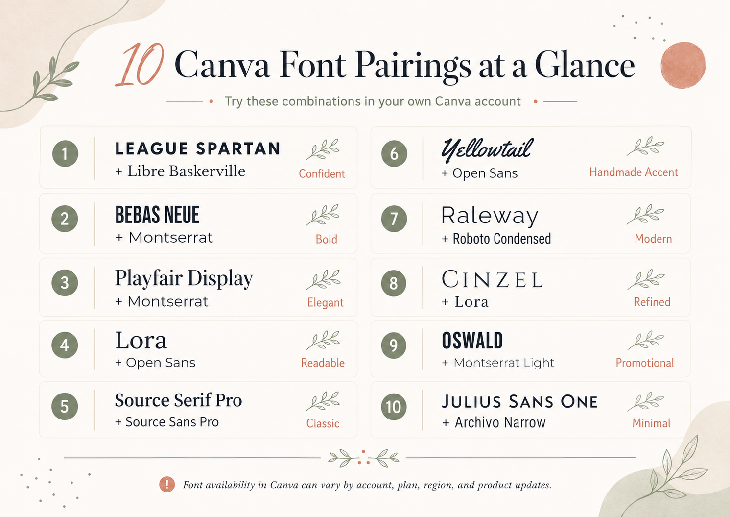
| Pairing | Mood | Try first if… | Heading role | Supporting role |
|---|---|---|---|---|
| League Spartan + Libre Baskerville | Confident | You need authority with readable support. | Strong headlines | Descriptions and PDFs |
| Bebas Neue + Montserrat | Bold | Your graphics use short headlines. | Announcements | Details and labels |
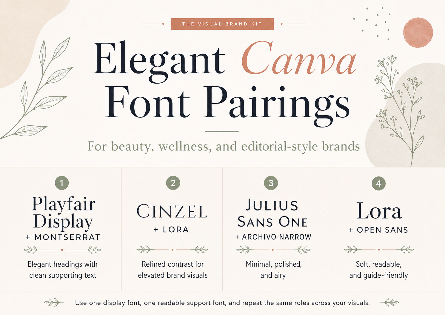
| Playfair Display + Montserrat | Elegant | You want beauty or wellness polish. | Display headings | Clean body copy |
| Lora + Open Sans | Warm | Guides and PDFs matter most. | Guide titles | Longer text |
| Source Serif Pro + Source Sans Pro | Balanced | You need a flexible content system. | Section titles | Dense information |
| Yellowtail + Open Sans | Handmade | You only need a small script accent. | Accent words | Readable details |
| Raleway + Roboto Condensed | Modern | You design compact service layouts. | Service headings | Labels and captions |
| Cinzel + Lora | Heritage | You want a classic boutique tone. | Short formal headings | Warm support text |
| Oswald + Montserrat Light | Condensed | Pinterest readability is a priority. | Pin titles | Short supporting copy |
| Julius Sans One + Archivo Narrow | Minimal | You need refined short headings. | Packaging or banners | Compact labels |
How to choose a Canva font pairing for your brand
A useful font pairing has contrast, hierarchy, readability, mood fit, and consistency. Contrast means the two fonts have different visual jobs. Hierarchy means the reader can tell what to read first. Readability means the supporting font can handle actual information, not just a few pretty words.
Before choosing fonts, define the brand direction. A calm wellness brand, a bold creative studio, and a handmade Etsy shop may all use Canva, but they should not automatically use the same typography. If you have not clarified the visual mood yet, start with a brand board in Canva and collect a few references before choosing type.
- Use contrast: pair a strong display font with a calmer text font.
- Build hierarchy: decide which font handles headings, subheads, labels, and body text.
- Protect readability: test captions, mobile pins, and PDF body copy before committing.
- Match the mood: choose fonts that support the brand feeling you want people to remember.
- Limit the system: one heading font, one supporting font, and one optional accent is usually enough.
You can find more Canva workflow context in the Canva branding guides and broader visual identity guidance in the branding hub.
Before saving a pairing into your brand board, test it on three real layouts: one small Pinterest pin, one PDF or lead magnet cover, and one information-heavy section such as a pricing guide or service description. This gives you a better read on spacing, mobile clarity, and whether the supporting font can handle practical business copy.
If a heading font only stays readable at large sizes, reserve it for display moments. If the supporting font feels too thin, too narrow, or too decorative in a small preview, choose a calmer option before building the rest of the brand system around it. A pairing should make repeated design decisions easier, not create a new readability problem in every Canva file.
Once a pairing passes those tests, write down the font roles in your brand board: heading, subheading, body text, accent, and any sizing notes you want to repeat. That small note prevents the common pattern of choosing a new font every time you open a template.
10 Canva font pairings for small business branding
Canva font availability note: Font availability in Canva can vary by account, plan, region, and product updates. Check the font names in your current Canva account before building a final brand system around a pairing.
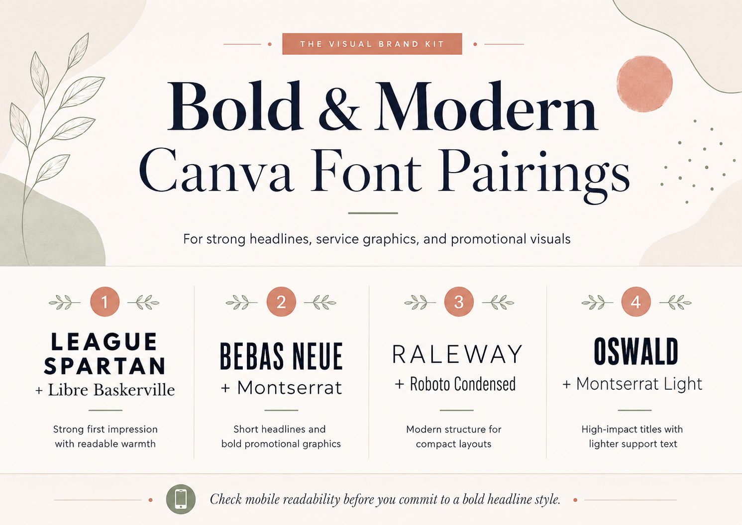
League Spartan + Libre Baskerville
Best decision reason: A confident service brand that needs a strong first impression and readable longer materials.
Typography mood: Confident, structured, and editorial with a warmer reading voice underneath.
- Use the first font for: Large headings, section titles, Pinterest pin headlines, and lead magnet covers.
- Use the second font for: Short descriptions, captions, PDF body copy, and supporting website text.
- Watch for: League Spartan is strong and wide; give headings room and avoid long all-caps lines.
- Example business types: Business coaches, strategy consultants, copywriters, and online educators.
- Try it on: Use it on a service guide cover where the title needs authority but the details still need warmth.
Bebas Neue + Montserrat
Best decision reason: Short headline graphics where the message has to land fast.
Typography mood: Bold, direct, modern, and quick to scan.
- Use the first font for: Short promotional graphics, workshop announcements, event graphics, and offer headers.
- Use the second font for: Supporting text, button-style labels, bullet points, and short descriptions.
- Watch for: Bebas Neue can feel loud if every word is oversized. Keep the headline short and let Montserrat do the explaining.
- Example business types: Fitness studios, photographers, salons, local service businesses, and bold creative studios.
- Try it on: Use it for a Pinterest pin title, a workshop graphic, or a pricing page banner with a short headline.
Playfair Display + Montserrat
Best decision reason: Beauty, wellness, photography, styling, and service brands that need polish without losing clarity.
Typography mood: Elegant display contrast with clean, modern support.
- Use the first font for: Hero headings, brand board titles, website headers, and lead magnet cover titles.
- Use the second font for: Navigation-style labels, paragraph text, checklist copy, and Canva template descriptions.
- Watch for: Playfair Display is strongest at larger sizes. Avoid using its high-contrast shapes for long paragraphs.
- Example business types: Estheticians, makeup artists, wedding photographers, personal stylists, and wellness coaches.
- Try it on: Use it on a lead magnet cover where the title can feel elegant and the subtitle stays easy to read.
Lora + Open Sans
Best decision reason: Educational brands, client resources, PDFs, and content that asks people to read more than a headline.
Typography mood: Warm, readable, grounded, and resource-friendly.
- Use the first font for: Guide titles, article graphics, section headings, and brand board labels.
- Use the second font for: Body copy, captions, workbook text, checklist instructions, and service descriptions.
- Watch for: Lora has personality, so keep layouts clean and avoid crowding it with too many decorative elements.
- Example business types: Consultants, therapists, coaches, educators, handmade educators, and resource-based brands.
- Try it on: Use it on a workbook or client PDF where the page needs to feel helpful rather than sales-heavy.
Source Serif Pro + Source Sans Pro
Best decision reason: Brands that publish long-form content and need typography that can repeat across many document types.
Typography mood: Orderly, balanced, and built for systems.
- Use the first font for: Guide headings, blog graphic titles, PDF section titles, and brand framework pages.
- Use the second font for: Paragraphs, tables, footnotes, captions, and supporting explanations.
- Watch for: Because the families are related, contrast must come from size, weight, spacing, and layout hierarchy.
- Example business types: Consultants, coaches, educators, B2B freelancers, and information-heavy service brands.
- Try it on: Use it in a pricing guide or consulting framework where sections, notes, and details need consistent roles.
Yellowtail + Open Sans
Best decision reason: A small handmade-style accent, not a full script-based brand system.
Typography mood: Friendly, handmade, casual, and personal.
- Use the first font for: One-word accents, signature-style details, packaging touches, and occasional friendly callouts.
- Use the second font for: Body text, product details, captions, shop policies, and anything that must be read quickly.
- Watch for: Keep Yellowtail secondary. Scripts can become hard to read in long text, small mobile graphics, and dense Pinterest layouts.
- Example business types: Etsy sellers, handmade brands, bakers, photographers, and casual personal brands.
- Try it on: Use it as one accent word on an Etsy shop banner, product tag, thank-you card, or brand board.
Raleway + Roboto Condensed
Best decision reason: Service menus, compact layouts, and brands that need a modern information hierarchy.
Typography mood: Clean, compact, modern, and organized.
- Use the first font for: Headings, service names, clean website headers, and brand board titles.
- Use the second font for: Labels, captions, comparison points, service details, and short supporting text.
- Watch for: Both fonts are sans serifs, so avoid making them the same size and weight. The hierarchy has to do the work.
- Example business types: Virtual assistants, studios, organizers, modern consultants, and digital service providers.
- Try it on: Use it on a service menu or website section where several offers need to look organized.
Cinzel + Lora
Best decision reason: Brands that want a classic or boutique tone without using a script font.
Typography mood: Heritage-led, formal, refined, and editorial.
- Use the first font for: Short headings, logo direction explorations, brand headers, and elegant section titles.
- Use the second font for: Subheadings, captions, short paragraphs, and supporting notes.
- Watch for: Cinzel can feel ceremonial. Avoid using it for long text or for brands that need a very casual tone.
- Example business types: Boutique photographers, florists, event brands, editorial blogs, and refined handmade shops.
- Try it on: Use it on a brand header or service guide cover where a heritage feeling is part of the mood.
Oswald + Montserrat Light
Best decision reason: Pinterest and promotional graphics that need strong hierarchy without decorative type.
Typography mood: Condensed, bold, practical, and promotion-friendly.
- Use the first font for: Pin titles, banner headlines, offer names, workshop titles, and clear visual hierarchy.
- Use the second font for: Supporting details, dates, short descriptions, and subheads.
- Watch for: Montserrat Light can become too faint at small sizes. Check mobile previews before using it for important text.
- Example business types: Service providers, local businesses, creative studios, and educators with bold content graphics.
- Try it on: Use it on a Pinterest template or announcement graphic where the headline needs to stay readable at feed size.
Julius Sans One + Archivo Narrow
Best decision reason: Minimal packaging, banners, and short headings where the design has enough white space.
Typography mood: Airy, minimal, refined, and light.
- Use the first font for: Short display headings, brand board titles, packaging labels, Etsy banners, and refined headers.
- Use the second font for: Supporting labels, captions, product notes, and compact text blocks.
- Watch for: Julius Sans One is delicate. Use strong contrast and avoid tiny sizes on mobile or Pinterest graphics.
- Example business types: Skincare brands, handmade shops, photographers, stylists, and calm service businesses.
- Try it on: Use it on a packaging mockup or shop banner where a quiet heading can still be large enough to read.
Which pairing fits your business type?
Use this table as a starting point, not a rule. A business type does not have to use one specific pairing; the better choice is the one that fits your brand mood and stays readable in your actual Canva files.
| Business type | Pairing to try | Why it can fit |
|---|---|---|
| Coach or consultant | League Spartan + Libre Baskerville | Strong first impression with warmer reading support. |
| Beauty or wellness brand | Playfair Display + Montserrat | Elegant display type balanced by clean supporting copy. |
| Photographer | Cinzel + Lora | Refined display tone with softer editorial support. |
| Modern service business | Raleway + Roboto Condensed | Compact structure for service menus and sections. |
| Handmade business | Yellowtail + Open Sans | Small personal accent with readable product information. |
| Etsy shop | Julius Sans One + Archivo Narrow | Light display style for banners, labels, and packaging. |
| Resource-heavy brand | Lora + Open Sans | Readable guides, PDFs, and educational content. |
| Bold creative business | Bebas Neue + Montserrat | Short headline graphics with versatile supporting text. |
Common Canva font-pairing mistakes
Most font-pairing problems are fixable once you know what to look for. Use these corrections before you rebuild a whole Canva brand system around a pairing.
- Using too many fonts: Do this instead: choose one heading font, one supporting font, and one optional accent.
- Choosing two fonts with the same role: Do this instead: pair a display font with a calmer reader-friendly font.
- Using a script for body text: Do this instead: keep scripts for one-word accents, signatures, or decorative details.
- Ignoring mobile readability: Do this instead: preview pins, covers, and captions at small sizes before saving the pairing.
- Changing typography across every design: Do this instead: repeat the same roles for pins, PDFs, website graphics, and brand boards.
- Choosing aesthetics before testing real layouts: Do this instead: test the pairing on a lead magnet cover, a pin, and a text-heavy page.
For more visual direction examples, browse brand board ideas for service businesses. If you are still deciding which design tool fits your workflow, compare Kittl vs Canva for branding or review brand board tools.
Want a more distinctive font direction beyond Canva’s built-in library?
The Canva pairings above are enough for many small businesses. If you need a more distinctive serif-led direction, the following external-font collection may be useful. Review current font files, compatibility, and licensing separately before you use one in your brand.
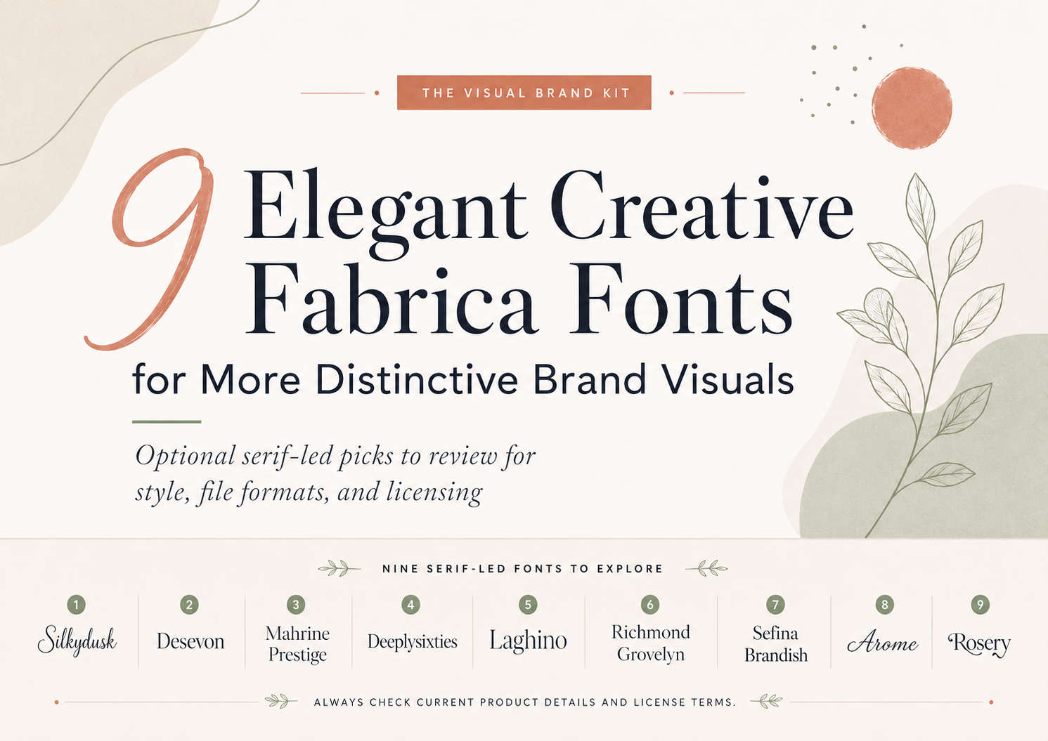
The following Creative Fabrica selection is mostly serif-led, editorial, and elegant. It is not meant to represent every possible font category, and an external font is not required for a polished brand system.
Creative Fabrica availability and license note: Product availability, subscription access, included files, and license terms can change. Review the current product page and applicable Creative Fabrica license before downloading or using a font.
A font recommendation is not legal advice. It does not imply trademark suitability, sole ownership rights for a mark, universal commercial-use safety, or confirmed compatibility with Canva or any other design tool.
Disclosure: This article contains affiliate links. If you purchase through one of these links, The Visual Brand Kit may earn a commission at no additional cost to you. Recommendations are selected for relevance to the topic and workflow, not because of affiliate compensation.
Start with the curated font roundup below, then continue to the Canva pairing guide for practical ways to build a consistent small business font system.
Refined editorial serifs
Silkydusk Font
Seller: Qweera Studio
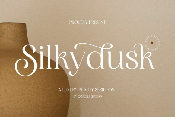
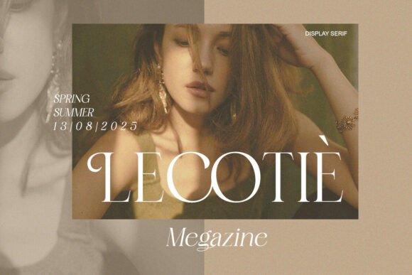
Product preview for Silkydusk by Qweera Studio via Creative Fabrica.
- Confirmed styles: Regular
- Confirmed formats: OTF, TTF, WOFF
- Editorial mood: A calm modern serif for refined service guide covers, boutique website hero titles, and quiet editorial brand boards.
- Use it for: Best as a display serif when the brand needs polish without a highly decorative script.
- Keep in mind: The verified style list is limited to Regular, so hierarchy needs to come from size, spacing, and pairing.
Desevon Font
Seller: Burntilldead
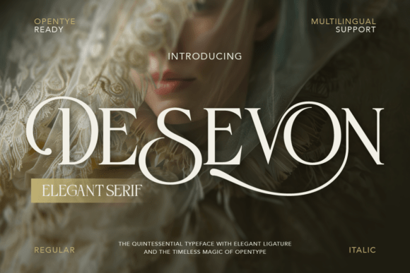
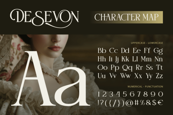
Product preview for Desevon by Burntilldead via Creative Fabrica.
- Confirmed styles: Regular and Italic
- Confirmed formats: OTF, TTF
- Editorial mood: A serif-led option for client PDFs, service menus, and clean website sections.
- Use it for: Useful when a brand needs a serif with an italic companion for softer emphasis.
- Keep in mind: The supplied file notes do not include WOFF, so recheck current file details if web use matters.
Check the current font listing
Laghino Font
Seller: Artisan Themes
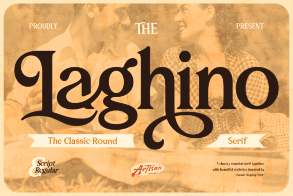
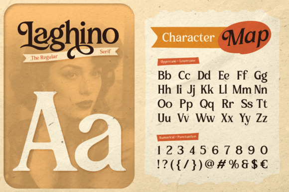
Product preview for Laghino by Artisan Themes via Creative Fabrica.
- Confirmed styles: Regular and Oblique
- Confirmed formats: OTF, TTF, WOFF
- Editorial mood: A restrained serif direction for boutique branding, pricing guide titles, and refined service collateral.
- Use it for: Good for brands that want a quieter editorial tone with an oblique style for contrast.
- Keep in mind: Check small-size readability before using it in captions, menus, or dense text blocks.
See current styles and formats
More expressive or distinctive serif directions
Deeplysixties Font
Seller: Maulana Creative
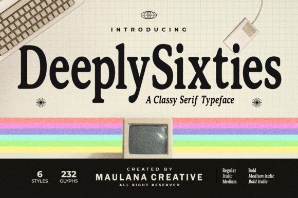
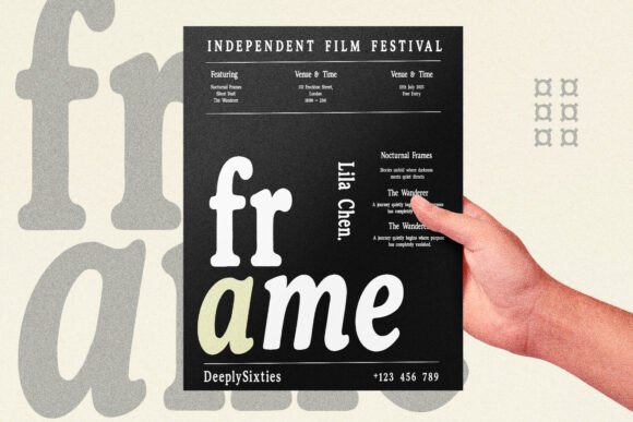
Product preview for Deeplysixties by Maulana Creative via Creative Fabrica.
- Confirmed styles: six visible styles
- Confirmed formats: OTF, TTF
- Editorial mood: A retro-leaning serif family for creative businesses, vintage-inspired packaging, and bold Pinterest graphics.
- Use it for: Best when the brand can support a stronger period-inspired type personality.
- Keep in mind: Its voice is strong, so it may not suit a neutral, minimal, or very corporate direction.
Review the font on Creative Fabrica
Richmond Grovelyn Font
Seller: Moontiontype
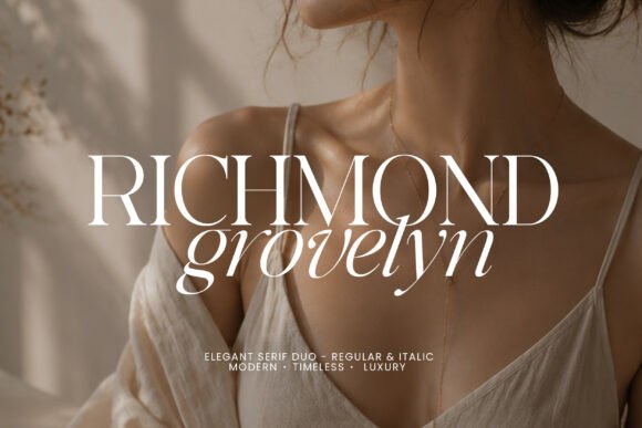
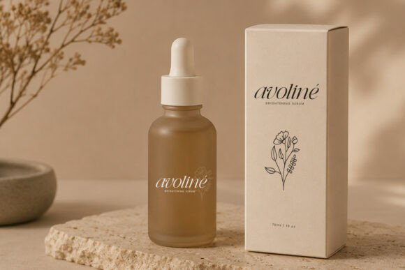
Product preview for Richmond Grovelyn by Moontiontype via Creative Fabrica.
- Confirmed styles: Regular and Italic
- Confirmed formats: OTF, TTF
- Editorial mood: A Regular-and-Italic serif direction for photographer guides, story-led layouts, and refined service materials.
- Use it for: Useful when the italic can add contrast to quotes, section openers, or editorial-style details.
- Keep in mind: If you need web font files, verify the current package details before planning website use.
Arome Font
Seller: Burntilldead
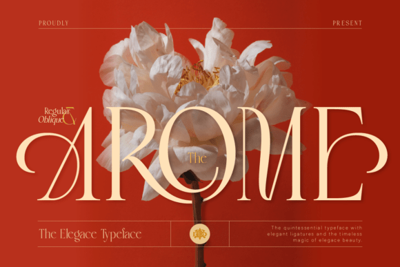
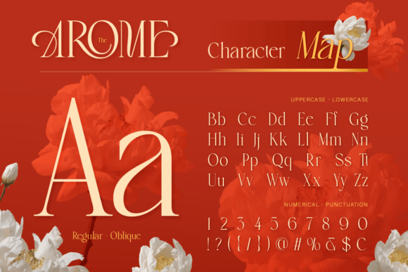
Product preview for Arome by Burntilldead via Creative Fabrica.
- Confirmed styles: Regular and Oblique
- Confirmed formats: OTF, TTF, WOFF
- Editorial mood: A clean serif option for minimal packaging, calm lead magnet covers, and restrained website graphics.
- Use it for: Best when the brand needs polish but should still feel quiet and uncluttered.
- Keep in mind: Check contrast and letter spacing in the actual design tool before using it for small text.
Check the current font listing
Feminine, boutique, or accent-led directions
Mahrine Prestige Font
Seller: Burntilldead
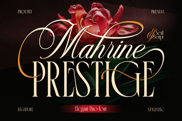
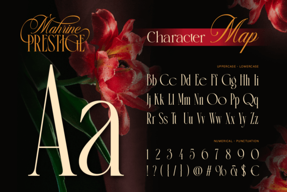
Product preview for Mahrine Prestige by Burntilldead via Creative Fabrica.
- Confirmed styles: serif and script duo
- Confirmed formats: OTF, TTF, WOFF
- Editorial mood: A serif plus script system for beauty packaging directions, accent-led brand headers, and boutique wordmark exploration.
- Use it for: Useful when the serif can carry the main message and the script stays secondary.
- Keep in mind: The script should remain an accent, not a paragraph font, caption font, or small mobile text choice.
See current styles and formats
Sefina Brandish Font
Seller: Font Liner
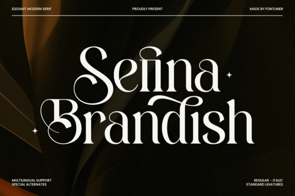
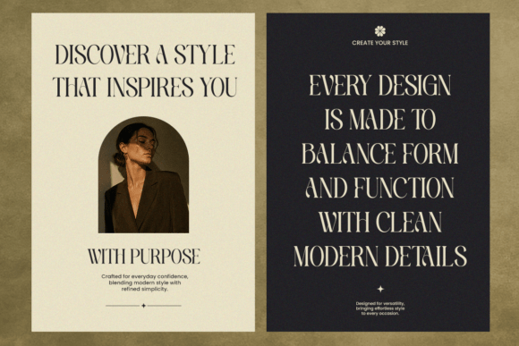
Product preview for Sefina Brandish by Font Liner via Creative Fabrica.
- Confirmed styles: Sefinabrandish Regular and Sefinabrandish Italic
- Confirmed formats: OTF, TTF, WOFF
- Editorial mood: A beauty and fashion-leaning serif for opt-in covers, service menus, and feminine visual systems.
- Use it for: Best as a display choice supported by a simpler reading font.
- Keep in mind: Use another font for long text so this serif can stay in a title or heading role.
Review the font on Creative Fabrica
Rosery Font
Seller: Font Liner
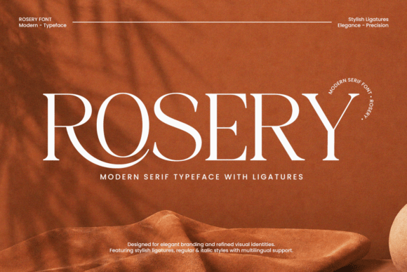
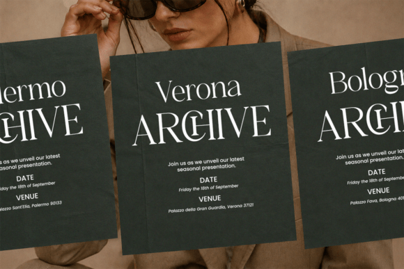
Product preview for Rosery by Font Liner via Creative Fabrica.
- Confirmed styles: Regular and Italic
- Confirmed formats: OTF, TTF, WOFF
- Editorial mood: A soft serif direction for esthetician brands, handmade packaging, product labels, and feminine service visuals.
- Use it for: Useful when the brand needs a gentle display serif rather than a bold or retro one.
- Keep in mind: Do not assume it fits every logo or trademark context; evaluate the use case and license before committing.
A small business brand can start to feel inconsistent when every Canva design uses a different font combination. One Pinterest pin has a script headline. A lead magnet uses a heavy condensed font. The website header uses something else entirely. None of those choices may be wrong on their own, but together they can make the brand harder to recognize.
This guide is for choosing Canva font pairings for small business branding in a practical way. You will see ten Canva pairing ideas to look for in your own account, how each pairing can work, where readability can become a problem, and how to think about more distinctive external font resources when Canva’s built-in options do not match the direction you need.
The article is useful even if you never buy an external font. Start with the Canva pairings, choose a simple type system, and document it on a brand board before you redesign every graphic.
Can you upload Creative Fabrica fonts to Canva?
The safest answer is: check the current requirements before you plan the design system around an external font. Canva font upload availability may depend on the user’s current Canva plan, account features, and current product behavior. A font file format alone does not confirm Canva compatibility.
Before using an external font in Canva, check the current Canva upload requirements, the product’s included files, and the applicable license terms. If the font cannot be uploaded or should not be used for your intended purpose, you can still use the Canva pairings above or choose another font resource that fits the same mood.
Do not assume a font is appropriate for a logo, trademark, packaging, client project, or commercial use without reviewing the current license and your specific use case.
A simple small business font system
A practical type system does not need many fonts. It needs clear roles. Choose one primary heading font, one readable supporting font, and one optional accent font. Then document where each font appears so you do not make a new decision every time you open Canva.
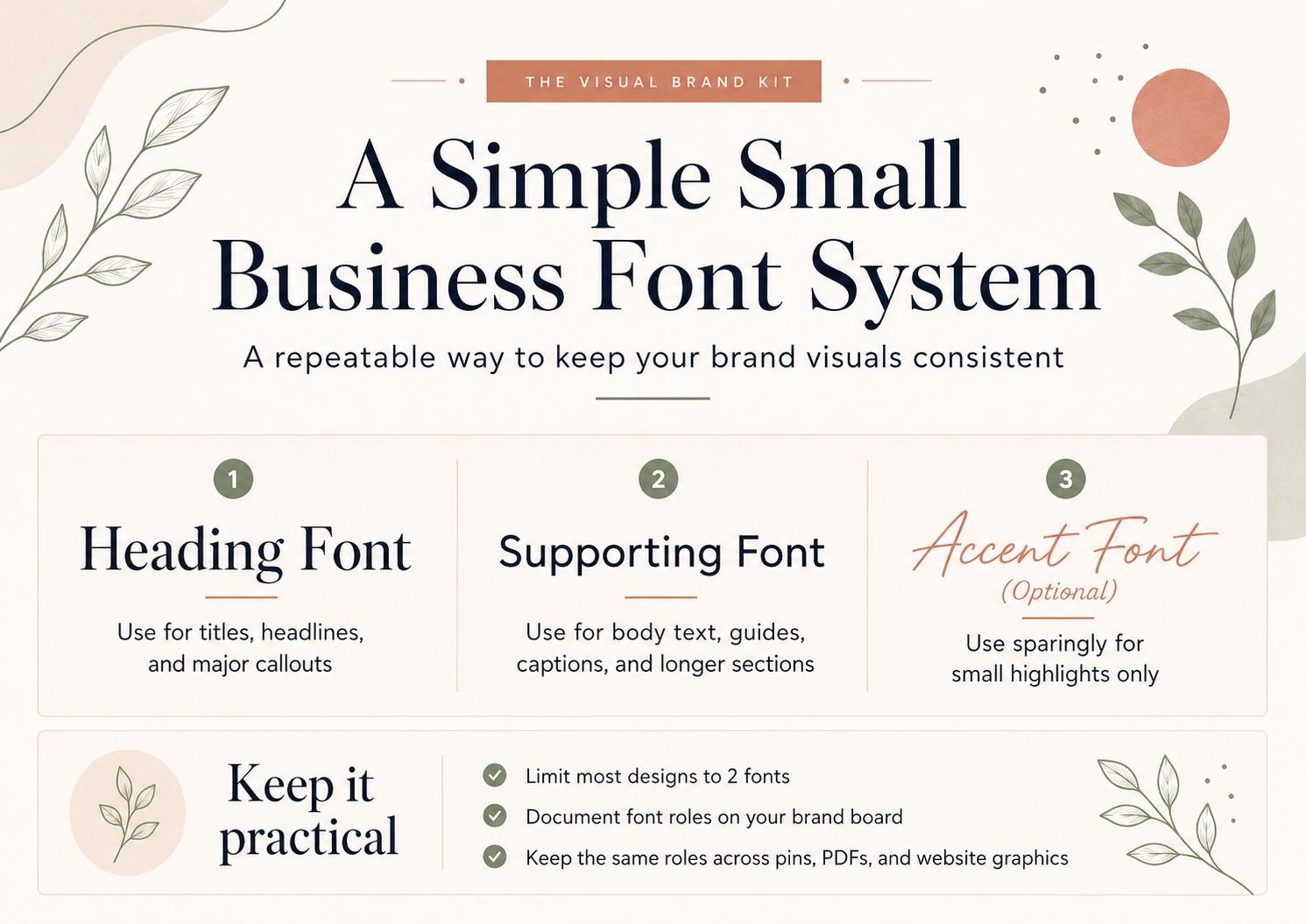
- Primary heading font: use it for brand headers, pin titles, lead magnet covers, and main section titles.
- Supporting font: use it for captions, paragraphs, descriptions, checklists, and details.
- Optional accent font: use it for short callouts, labels, or one-word accents only.
- Repeatable sizing: save a few heading and body sizes that work on mobile and desktop.
- Brand-board documentation: record font names, roles, spacing notes, and examples in one place.
If you are building a free resource or branded PDF, apply the type system inside your Canva lead magnet workflow. If you are documenting the whole visual system, start with the brand board guide first.
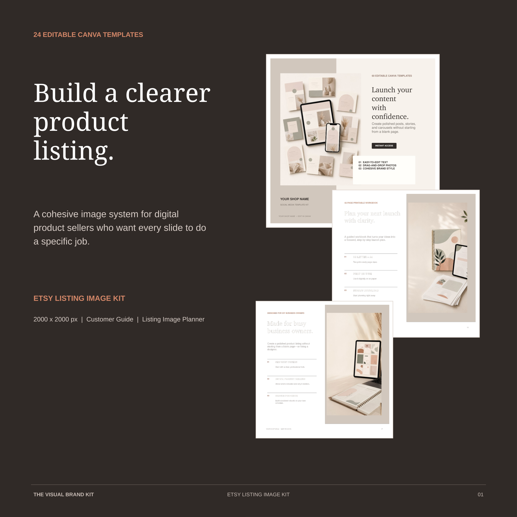
Selling on Etsy?
Apply the same heading and supporting font roles to a repeatable product-image sequence. The Etsy Listing Image Kit includes 24 editable square Canva templates, a Customer Guide, and a Listing Image Planner.
Final thoughts
A strong Canva font pairing for a small business is one you can use consistently. It should fit the brand mood, stay readable in real marketing materials, and be simple enough to repeat across pins, PDFs, website graphics, packaging, and client-facing documents.
Start with one pairing from this guide, test it in your Canva account, and build a small type system before adding more fonts. When Canva’s built-in options do not fit the direction you need, use external font resources carefully and review current product details before using them.
Explore Canva branding guides or start with a brand board. For affiliate context, see the Affiliate Disclosure.