Best Fonts for Small Business Logos
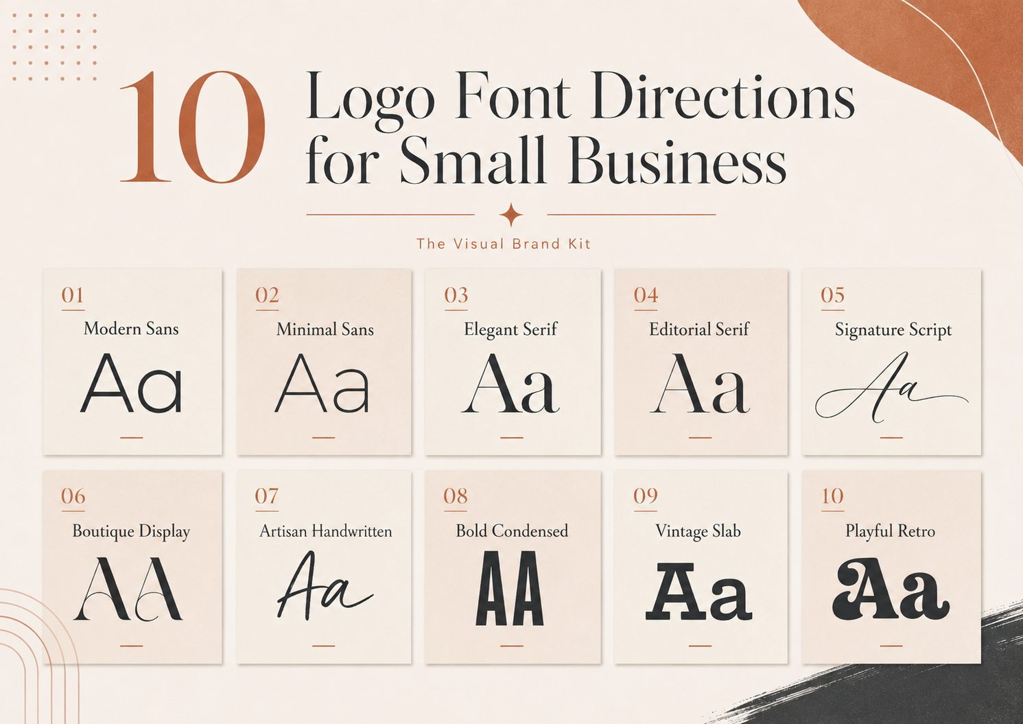
10 Creative Fabrica Fonts to Explore for Small Business Logo Direction
This curated roundup presents ten different visual directions for a small business wordmark or logo. You will find quiet modern sans serifs, editorial serifs, personal scripts, bold display styles, and more character-led options. The best choice is not simply the most decorative font: it needs to fit the personality of the business, remain readable in practical uses, and work with the rest of the brand system. Before committing, type the complete business name, compare more than one direction, and test the result at the sizes your customers will actually see.
This article contains affiliate links. If you make a purchase through one of these links, The Visual Brand Kit may earn a commission at no extra cost to you. Recommendations are based on editorial relevance, and you should always review the current product details and license terms before using a font for business or client work.
Read the full Affiliate Disclosure.
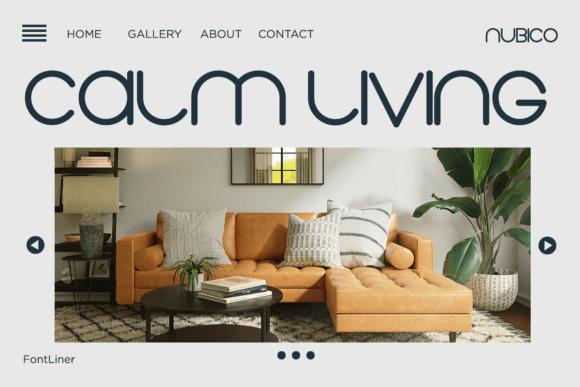
Nubico
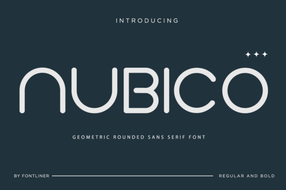
Nubico offers a clean, forward-looking direction for a business that wants its wordmark to feel modern without relying on sharp, severe geometry. The rounded construction can work especially well when the rest of the identity uses generous spacing, simple color, and uncluttered layouts.
- Best for: tech consultants, modern coaches, digital service businesses, startups, and contemporary brands.
- Style direction: Modern geometric rounded sans serif.
- Why it stands out: Its rounded geometry feels current and friendly while still giving a short business name a clear, designed silhouette.
- What to test before using it: Check whether the rounded forms still feel credible in formal proposals and whether a longer name stays distinct at mobile-header size. It may feel too futuristic or informal for traditional, heritage, legal, or highly conservative brands.
View Nubico on Creative Fabrica
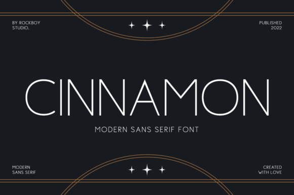
Cinnamon
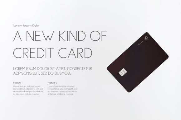
Cinnamon is the most restrained option in this roundup. That simplicity can be useful for service businesses that want a tidy, professional wordmark and do not need the logo font to carry every part of the brand personality on its own.
- Best for: consultants, virtual assistants, coaches, professional service businesses, and minimalist brands.
- Style direction: Minimal modern sans serif.
- Why it stands out: The restrained letterforms provide a calm starting point that can sit comfortably beside practical website and document typography.
- What to test before using it: Try several letter-spacing options and compare the plain wordmark with a small supporting symbol. A very minimal font may need thoughtful spacing, color, or a supporting graphic element to feel distinctive.
View Cinnamon on Creative Fabrica
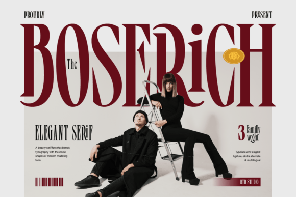
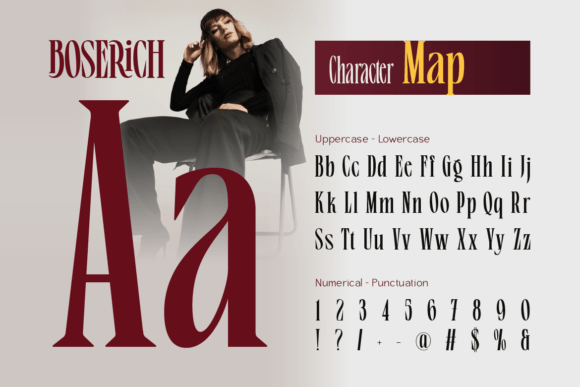
Boserich
Boserich is a stronger fit when the brand direction is refined, visual, and editorial. It can give a short name an elegant presence, particularly when the surrounding layout is simple enough to let the letterforms remain the focal point.
- Best for: beauty, skincare, fashion, premium personal brands, and editorial-style businesses.
- Style direction: Elegant high-contrast serif.
- Why it stands out: The contrast between thick and thin strokes creates a fashion-editorial impression that can make a concise name feel polished.
- What to test before using it: Reduce the wordmark to the size of a mobile header, social avatar, and narrow product label. Thin strokes must be checked carefully at small sizes and on mobile.
View Boserich on Creative Fabrica
Almanac Zitole
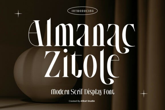
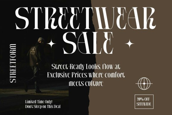
Almanac Zitole brings more visible personality than a quiet text serif. It suits a brand that wants an editorial or boutique feel and is prepared to use a simpler supporting font everywhere the audience needs to read quickly.
- Best for: boutique businesses, beauty packaging, fashion brands, photographers, and editorial visual identities.
- Style direction: Modern editorial serif display.
- Why it stands out: Its expressive display shapes create a recognizable wordmark direction without requiring a script treatment.
- What to test before using it: Use the full business name, not only a short sample, and compare light and dark backgrounds. It is better suited to wordmarks and large display use than to long body text.
View Almanac Zitole on Creative Fabrica
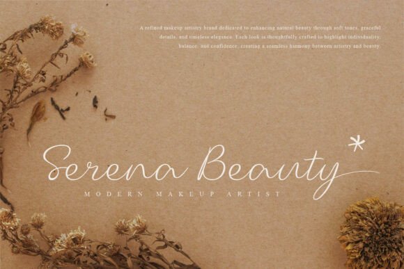
Mellonia
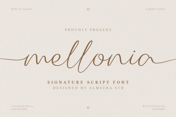
Mellonia is the script-led option for a brand that wants a personal, polished gesture rather than a structured typographic mark. It works best when the word itself is reasonably short and the rest of the brand system stays clear and restrained.
- Best for: photographers, beauty professionals, feminine personal brands, and service businesses with a personal feel.
- Style direction: Polished signature script.
- Why it stands out: The signature quality can make a personal-name business feel more intimate and owner-led than a conventional serif or sans serif.
- What to test before using it: Check every letter connection in the real name and create a simpler small-size version if needed. Long business names can become difficult to read in avatars, watermarks, and mobile headers.
View Mellonia on Creative Fabrica
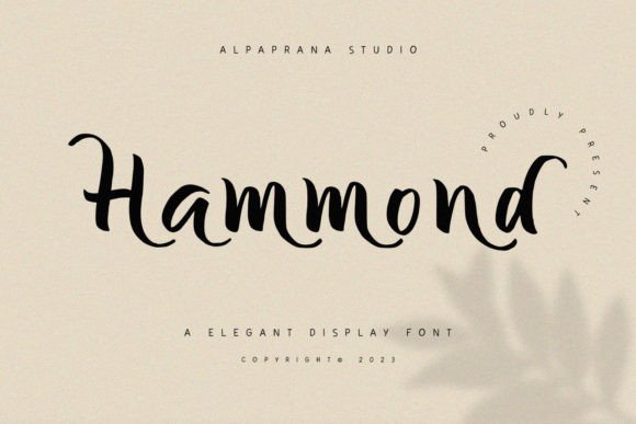
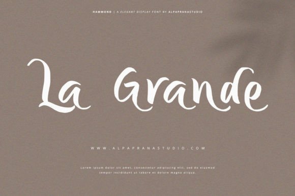
Hammond
Hammond sits between polished and expressive. It can support a premium creative direction without feeling as delicate as a thin high-contrast serif, but the wordmark still needs enough space to let its distinctive shapes read clearly.
- Best for: creative consultants, photographers, boutique businesses, premium service providers, and fashion-related businesses.
- Style direction: Elegant modern display font.
- Why it stands out: The expressive display character gives a wordmark more movement and individuality than a neutral business font.
- What to test before using it: Compare a restrained version with any decorative alternates you are considering. Decorative details should be used selectively so the business name remains readable.
View Hammond on Creative Fabrica
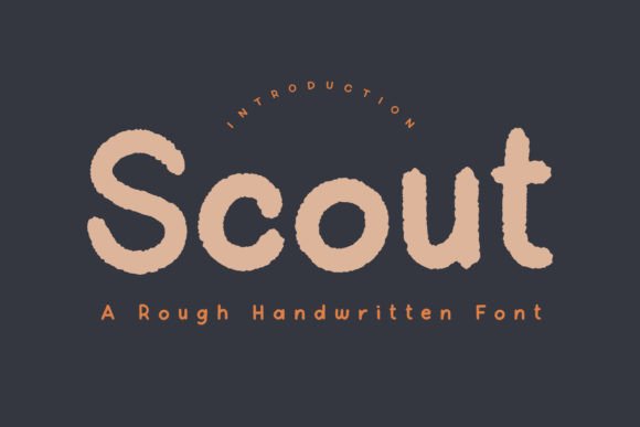
Scout
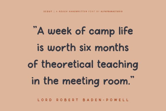
Scout moves away from polished editorial branding and toward a casual, made-by-hand impression. It can be effective when the business itself is tactile or informal and the roughness feels connected to the product rather than added as decoration.
- Best for: handmade businesses, makers, cafes, creative studios, Etsy shops, and artisan brands.
- Style direction: Rough handwritten artisan font.
- Why it stands out: Its uneven handwritten texture adds an intentionally human quality that can complement handmade products and informal creative work.
- What to test before using it: Place it beside actual product photography and test it in a small shop avatar. It is not a natural fit for corporate, financial, clinical, or highly formal brands.
View Scout on Creative Fabrica
Bondari
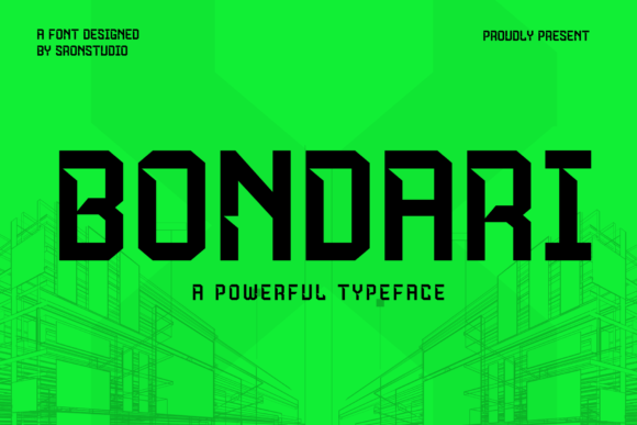
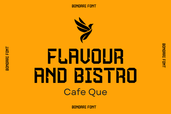
Bondari is built for visual impact. A short name can become compact, direct, and easy to notice, making this direction useful for businesses that need a confident sign, storefront mark, or strong social graphic rather than a delicate editorial identity.
- Best for: contractors, barbers, fitness brands, automotive services, masculine branding, and short bold business names.
- Style direction: Bold condensed display font.
- Why it stands out: The condensed proportions create strong vertical impact while keeping a short name compact enough for signage and badge-style layouts.
- What to test before using it: Set the longest version of the business name and compare wide and narrow placements. Heavy condensed letterforms can overpower long names or crowded supporting text.
View Bondari on Creative Fabrica
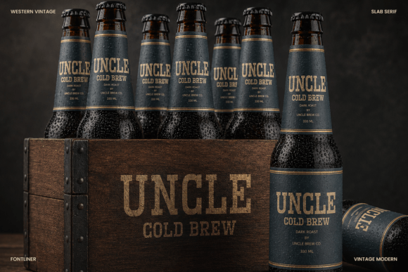
Western Vintage
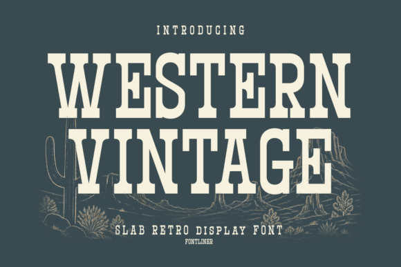
Western Vintage is the most theme-specific option in the list. It can make sense when the business already has a rustic, regional, outdoor, or heritage narrative and needs a wordmark that feels substantial rather than polished and minimal.
- Best for: coffee shops, bakeries, restaurants, rustic brands, heritage-inspired businesses, and outdoor or craft businesses.
- Style direction: Vintage slab serif.
- Why it stands out: Its sturdy slab shapes and vintage character quickly establish a heritage-inspired visual direction.
- What to test before using it: Review whether the western theme supports the real brand story instead of becoming a costume. Its strong character is unsuitable for many beauty, wellness, and consultant brands.
View Western Vintage on Creative Fabrica
Soda Hendrix
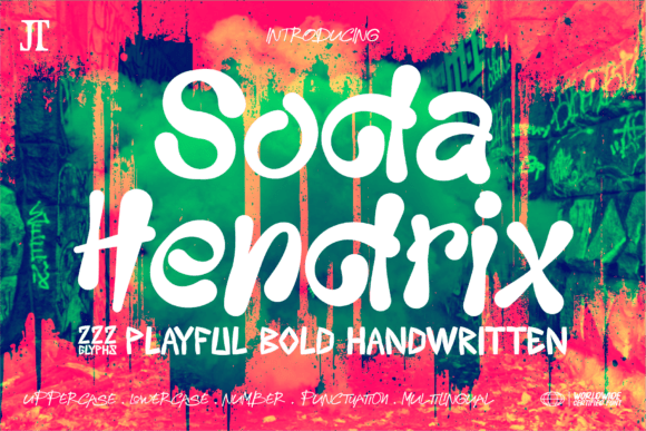
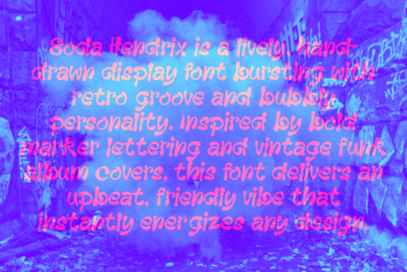
Soda Hendrix closes the roundup with a playful retro direction. It is useful for businesses whose personality is intentionally colorful and lighthearted, especially when a neutral sans serif supports practical information such as prices, navigation, and product details.
- Best for: bakeries, cafes, creative shops, kids-related businesses, colorful lifestyle brands, and playful online stores.
- Style direction: Playful retro display font.
- Why it stands out: The lively retro shapes can give a cheerful brand a memorable, informal voice without relying on a conventional script.
- What to test before using it: Try both muted and colorful applications and confirm that the name remains clear at a glance. It is not suitable for businesses requiring a restrained, neutral, or highly formal presentation.
View Soda Hendrix on Creative Fabrica
Quick Answer
A good logo font should match the personality of the business, remain readable at small sizes, work in different contexts, and support a consistent visual brand system. A polished serif can suit an editorial beauty business, while a rounded sans serif may be more useful for a modern consultant or digital service. A handmade shop may benefit from an artisan direction that would feel out of place for a financial or clinical business. If that is your direction, compare these font pairings for handmade business branding before choosing the final logo and companion type. No single font category is best for every small business. Shortlist two or three directions, type the actual business name, and compare them in a website header, social profile, and small black-and-white version. The strongest option is usually the one that still feels appropriate after the decorative presentation is removed and the practical tests begin.
What Makes a Font Suitable for a Small Business Logo?
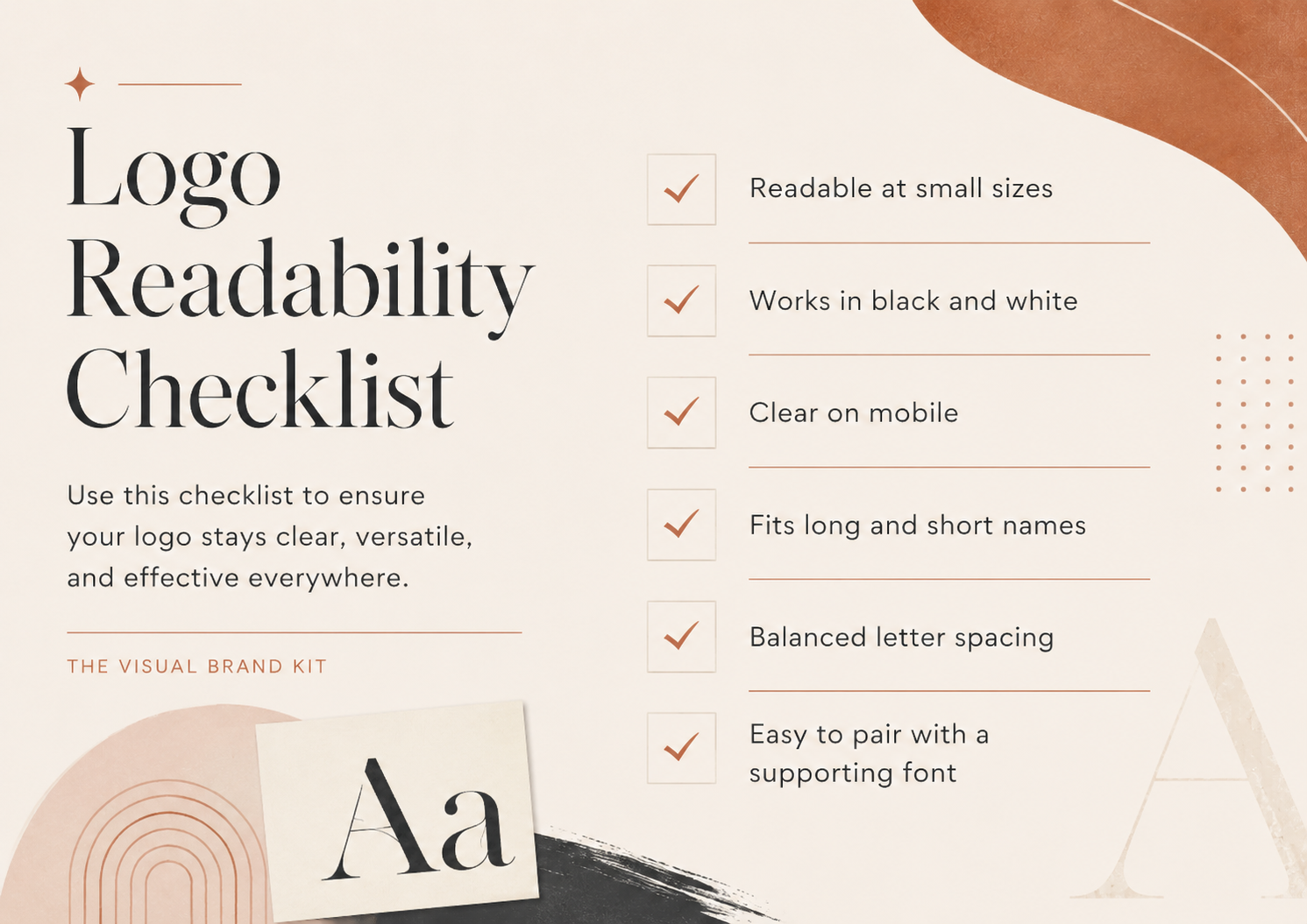
Readability is the first requirement. Customers should be able to recognize the business name without studying unusual letterforms or guessing where one script letter ends and another begins. Recognizability also matters, but it should come from a coherent shape, spacing, and brand context rather than from adding decoration to every character.
A useful logo font also needs to fit the brand. Consider whether its level of formality, energy, softness, or texture supports the experience the business actually provides. Then test scalability: a wordmark that works on a wide website header may fail inside a small profile image. Review letter spacing, especially around awkward pairs, and test both the full legal or descriptive name and any shorter trading name.
Finally, view the logo in black and white and decide how it will live beside supporting typography. The logo font does not need to carry menus, paragraphs, pricing guides, or captions. Those jobs usually need a simpler companion font with reliable readability.
How to Match a Logo Font to Your Brand Personality
Start with a few plain-language traits that describe how the business should feel, then look for a font direction that supports those traits. This is a practical creative filter, not a promise that every viewer will respond to a font in the same way.
- Modern and efficient: consider a geometric or minimal sans serif with clean spacing.
- Calm and professional: try a restrained sans serif or readable serif that does not compete with the message.
- Elegant and premium: explore high-contrast or editorial serifs, then test fine strokes carefully.
- Friendly and personal: a rounded sans serif or controlled signature detail may feel more approachable.
- Bold and energetic: a condensed or heavy display face can give a short name more impact.
- Handmade and artisan: rough handwritten forms or sturdy vintage serifs can connect to tactile products and craft.
- Playful and retro: expressive display lettering can work when color and personality are central to the offer.
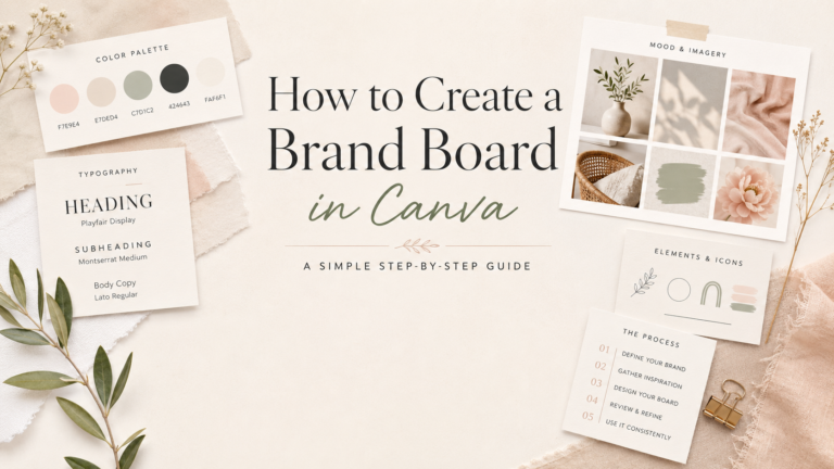
Collect the chosen traits, colors, logo direction, and supporting type in one place when you create a brand board in Canva. If the direction is still unclear, review these brand board ideas for service businesses to compare how different personalities can become practical visual systems.
Serif, Sans Serif, Script, or Display?
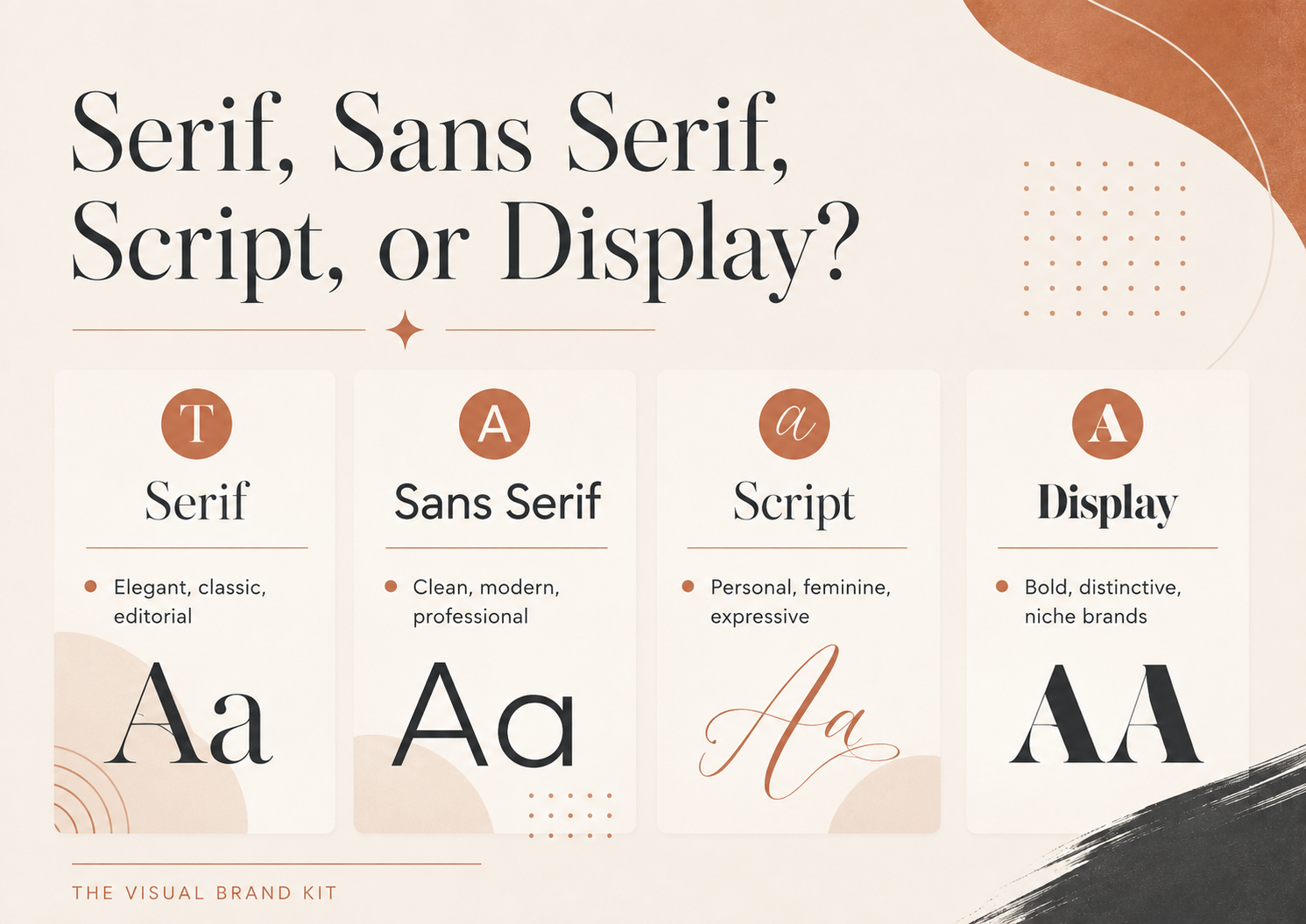
These four broad categories are useful for narrowing the search, although individual fonts can blend characteristics from more than one category. Choose the category that supports the business and the real wordmark, not the one that looks most dramatic in a product preview.
- Serif: Letterforms have small finishing strokes. Best for: editorial, established, refined, or heritage-inspired directions. Watch out for: thin details that disappear at small sizes.
- Sans serif: Letterforms omit those finishing strokes. Best for: modern, efficient, approachable, and versatile branding. Watch out for: a very neutral choice may need stronger spacing, color, or a supporting symbol to become distinctive.
- Script: Letterforms imitate connected handwriting or a signature. Best for: personal-name businesses, beauty, photography, and selective friendly accents. Watch out for: long names, tight letter connections, and poor small-size readability.
- Display: Letterforms are designed to attract attention and often carry a strong theme. Best for: short wordmarks with a clear personality. Watch out for: novelty, limited versatility, and using the same font for ordinary reading.
Logo Font vs Supporting Brand Font
Your logo font does not need to be your website body font. In many small business identities, the logo is the most expressive typographic element, while the website, proposals, pricing guides, and social graphics use a simpler supporting serif or sans serif. This division keeps the wordmark distinctive without making every customer touchpoint difficult to read.
If the logo uses a decorative script or display face, pair it with a calm companion and define clear roles for headings, body copy, and captions. The guide to Canva font pairings for small business branding can help you build that supporting system. Document the final choices on a brand board so future designs do not start from scratch.
How to Test a Logo Font Before You Commit
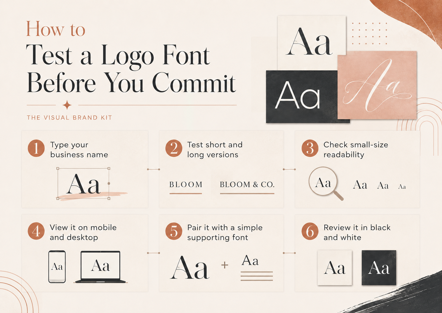
Use this six-step workflow before making the font the center of the identity:
- Type the full business name. Product samples often use short words chosen to flatter the font.
- Test short and long versions. Compare the main name with any descriptor, location, or tagline you may need.
- Check small-size readability. Reduce the wordmark until it matches a mobile header or social profile.
- View it on mobile and desktop. A wide wordmark can feel very different when the available space changes.
- Pair it with a simple supporting font. Make sure the hierarchy feels intentional rather than crowded.
- Review it in black and white. The core letterforms should still work when color and effects are removed.
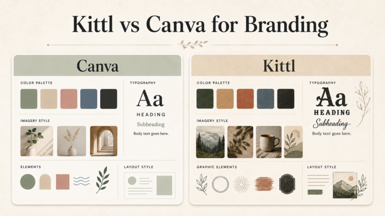
Place the strongest two or three options into real mockups: a website header, favicon or profile image, business card, Pinterest graphic, social profile, watermark, pricing guide, and packaging if packaging is relevant to the business. You can compare how the complete identity behaves in Canva, or review Kittl vs Canva for branding if you are choosing a design tool for the wider workflow.
Common Small Business Logo Font Mistakes
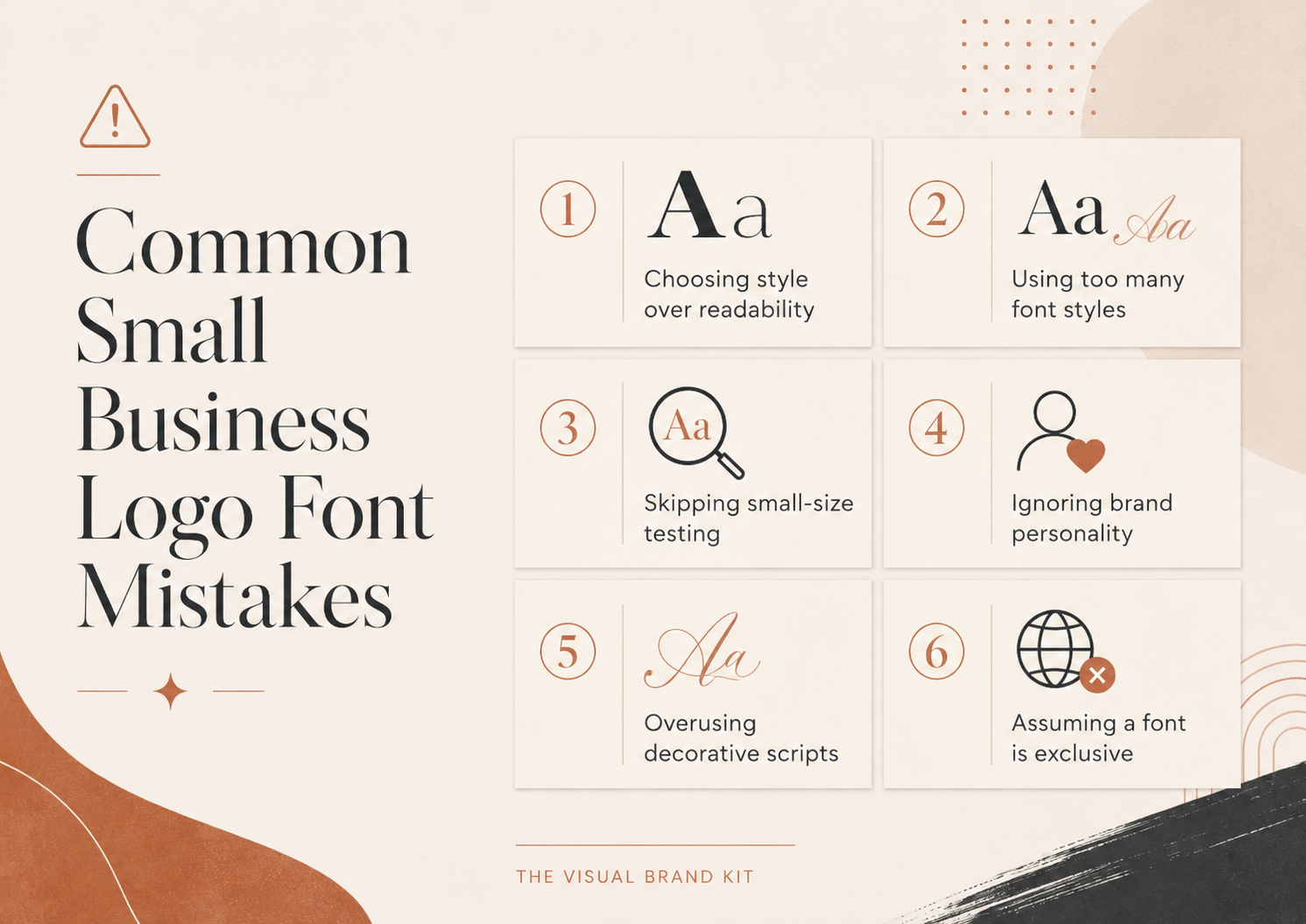
- Choosing style over readability. A beautiful sample is not useful if customers cannot read the actual business name.
- Using too many font styles. One logo face and one or two supporting roles are usually easier to manage than a collection of unrelated fonts.
- Skipping small-size testing. Thin serifs, condensed letters, and scripts often change character when reduced.
- Ignoring brand personality. A fashionable font can still conflict with the level of trust, energy, or formality the business needs.
- Overusing decorative scripts. Keep scripts for short, legible roles and let simpler typography handle information.
- Assuming a purchased font is exclusive. A valid license may allow use, but it does not stop other businesses from choosing the same typeface.
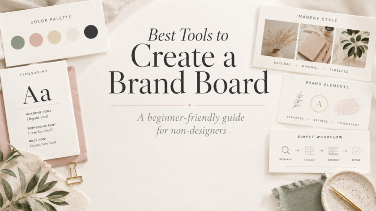
Once the logo direction is stable, compare tools for creating a brand board and use the board to keep fonts, colors, image direction, and recurring design rules consistent.
Font Licensing, Exclusivity, and Trademark Notes
Font licensing and trademark availability are separate questions. Obtaining a font license does not automatically make a logo exclusive, and other businesses may legally use the same font. Review the current product and license terms for the way you plan to use the files, including business or client work. For trademark questions, consider advice from a qualified legal professional. This article does not provide legal advice or claim trademark clearance for any font or logo direction.
Note: These fonts can help you explore a wordmark or logo direction. A font license does not automatically make a logo exclusive or confirm trademark availability.
Frequently Asked Questions
What type of font is best for a small business logo?
The best type matches the personality of the business and remains readable in its real uses. A modern consultant may prefer a clean sans serif, while a boutique brand may choose an editorial serif. Test the actual name before deciding.
Are serif fonts good for business logos?
Yes. Serifs can create a refined, editorial, established, or heritage-inspired direction. High-contrast serifs need careful small-size testing because fine strokes can lose clarity on mobile or in compact marks.
Can I use a script font for my logo?
A script can work for a short, personal, or service-led name when every letter remains clear. Avoid forcing a long business name into a tightly connected script, and create a simpler small-size option if needed.
Should my logo font match my website font?
Not necessarily. The logo can use a distinctive display, serif, or script face while the website uses a simpler supporting font for navigation and body text. The system should feel related, but the roles can differ.
How many fonts should a small business brand use?
Many small brands can work with one logo font plus one or two supporting roles. What matters is a clear rule for headings, body copy, and accents rather than a fixed number applied to every business.
Can I use a Creative Fabrica font in a business logo?
Check the current product details and applicable license terms for the specific font and intended use. Do not assume that every product, client project, file type, or trademark use is covered in the same way.
Does buying a font make my logo exclusive?
No. Purchasing or licensing a font does not automatically prevent other businesses from using the same typeface. Licensing, logo distinctiveness, and trademark availability are separate considerations.
How do I test whether a logo font is readable?
Type the complete name, reduce it to mobile-header and profile-image size, view it in black and white, and ask whether every letter can be recognized quickly. Test wide, square, and narrow placements before committing.
Final Thoughts on Choosing a Small Business Logo Font
Begin with brand personality and readability, then shortlist two or three directions that fit the business. Type the actual name, test mobile and small-size performance, and compare each option without relying on color or mockup effects. Use a simpler supporting font for everyday reading, verify the current licensing terms, and build the rest of the typography system around the direction that works most consistently.
For the next step, use the Canva font pairings for small business branding guide to choose practical supporting typography, then collect the final logo, font roles, colors, and image direction in a brand board. More small business branding guides are available in the Branding hub.