25 Brand Board Ideas for Service Businesses
A brand board gives your business a simple visual system you can repeat across your website, Canva designs, Pinterest graphics, lead magnets, and client-facing materials.
For service businesses, this matters because your visuals often have to do more than look nice. They need to help people understand what you do, feel confident in your work, and recognize your brand when they see it again.
This guide shares 25 brand board ideas for coaches, consultants, beauty professionals, wellness brands, photographers, freelancers, and other service-based businesses. Use them as starting points, not strict templates.
Quick Answer
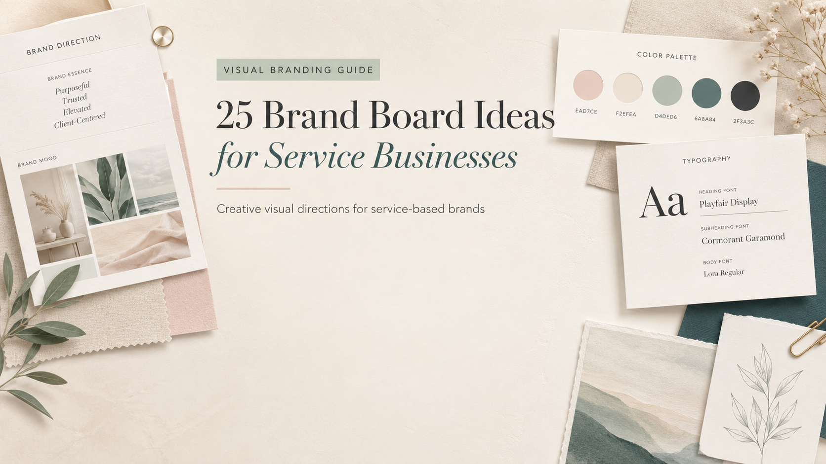
A brand board is a one-page visual reference that shows your brand colors, fonts, logo direction, image style, and overall visual mood. For service businesses, it helps keep Canva templates, Pinterest pins, lead magnets, pricing guides, client materials, and social content consistent.
Who This Guide Is For
This guide is for non-designer small business owners who want practical visual branding direction without getting buried in design theory. It is especially useful for coaches, consultants, estheticians, beauty professionals, wellness professionals, freelancers, photographers, and service businesses.
Before you build more Canva templates, get your brand basics organized.
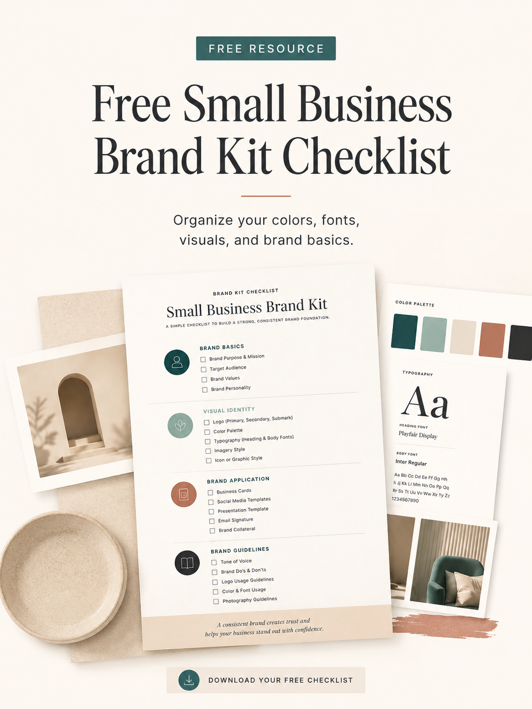
Download the Free Small Business Brand Kit Checklist to organize your colors, fonts, visuals, and brand basics before you create more marketing materials.
What Is a Brand Board?
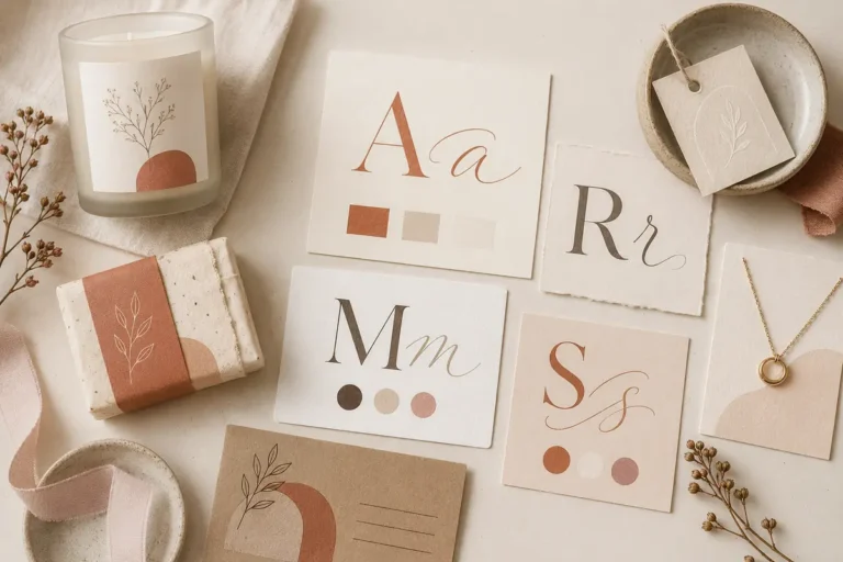
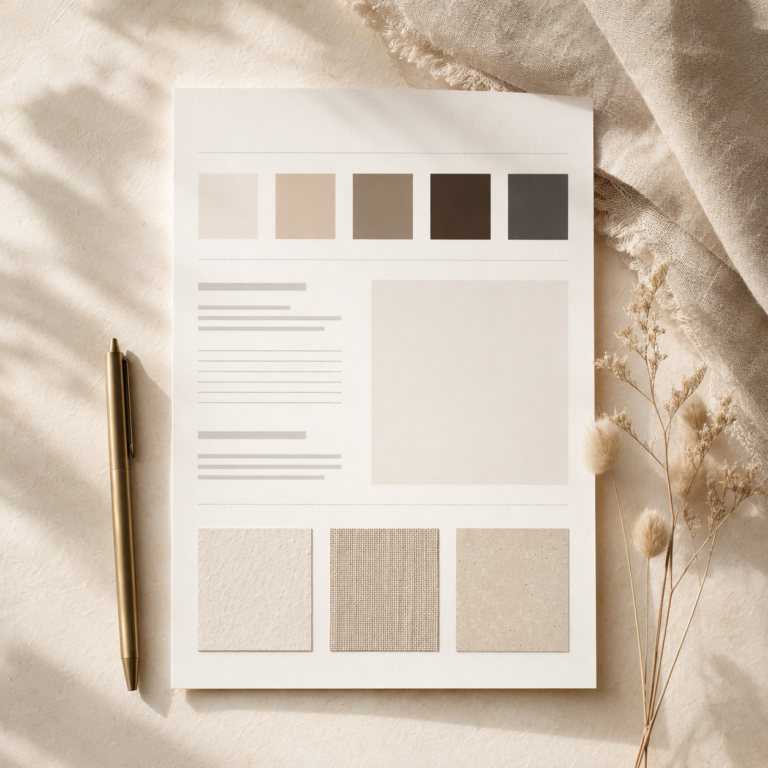
A brand board is a one-page visual reference for your brand. It usually includes your logo or wordmark, color palette, fonts, image style, graphic details, and examples of how your brand should feel visually.
It is not the same as a full brand strategy. Think of it as a practical design guide you can keep open while creating Canva graphics, Pinterest pins, social posts, PDFs, website sections, and email opt-ins.
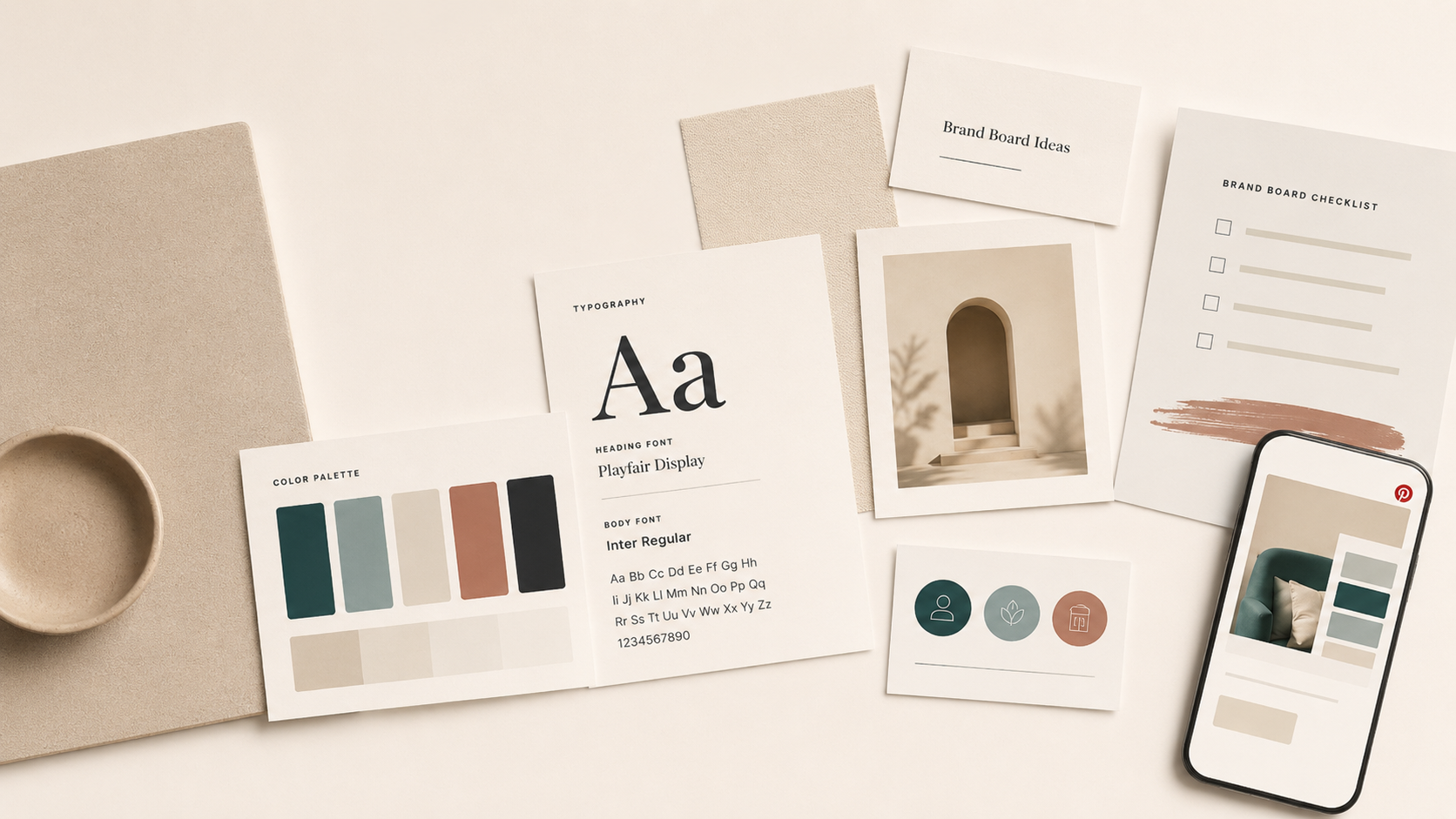
Brand Board Checklist: What to Include
Use this brand board checklist before you build more Canva templates. You do not need every item to be final; choose enough to make the next design decision easier.
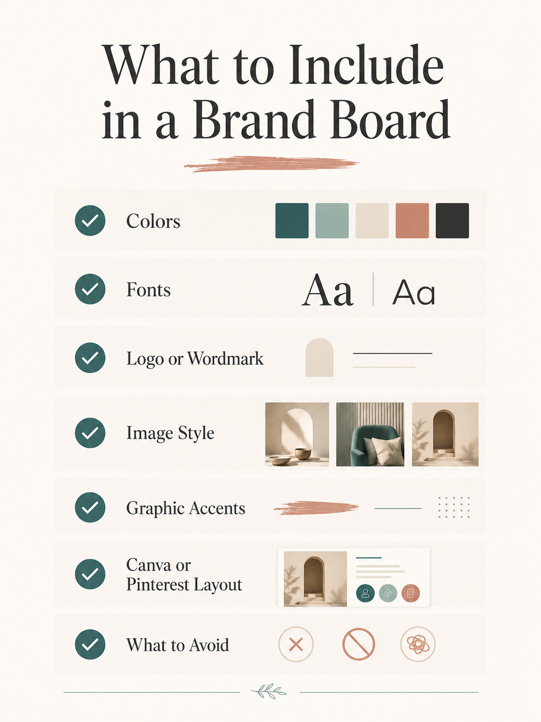
- Primary logo or simple wordmark
- Color palette
- Font pairings
- Button or CTA style
- Image direction
- Graphic accents or icons
- Example Pinterest pin or Canva layout
- Notes on what to avoid
You do not need a complicated design system to start. A useful brand board is one you can actually repeat.
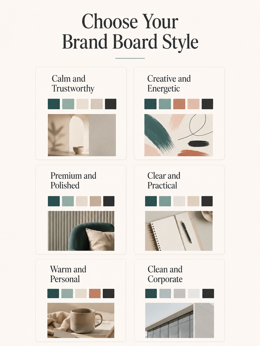
How to Choose a Brand Board Direction
| Brand feeling / direction | Choose this style if… | Good fit for |
|---|---|---|
| Calm and neutral | You want your brand to feel soft, steady, and easy to trust. | Coaches, therapists, consultants, wellness providers |
| Premium and high contrast | You want a more polished, editorial, high-value feeling. | Consultants, studios, photographers, luxury services |
| Warm and approachable | You want your brand to feel personal, helpful, and easy to connect with. | Freelancers, virtual assistants, educators, service providers |
| Feminine and polished | You want softness and elegance without losing clarity. | Beauty brands, estheticians, coaches, wellness businesses |
| Earthy and natural | You want a grounded, organic, lifestyle-inspired visual direction. | Wellness, lifestyle, handmade, home, and creative services |
| Bold and energetic | You want stronger contrast, bigger personality, and more memorable graphics. | Speakers, creators, educators, personal brands |
| Clean and corporate | You want structure, professionalism, and simple repeatable layouts. | Consultants, analysts, local services, B2B providers |
| Creative and expressive | You want your visuals to feel distinctive, curated, and portfolio-friendly. | Designers, photographers, studios, creative service brands |
How to Use These Brand Board Ideas
Do not copy a brand board direction exactly. Use these ideas as visual starting points, then adapt the colors, fonts, imagery, and examples to fit your own business.
The best brand board is not the trendiest one. It is the one you can use consistently across Canva, Pinterest, lead magnets, client materials, and your website without rebuilding your look every week.
Optional Creative Fabrica Resources for Exploring Your Brand Direction
If you want an editable starting point, these three resources cover different parts of the process: a one-page style board, a mood-board bundle for image direction, and a font-and-logo-led brand board. Use the structure, then replace every color, font, image, and label with choices that fit your own business.
Affiliate note: This section contains affiliate links. If you buy through them, The Visual Brand Kit may earn a commission at no extra cost to you. Read the full disclosure.
Brand Style Board Canva Template
A clean one-page Canva template for organizing your logo, colors, fonts, and imagery. It is a practical option when you want a simple reference to keep open while designing.
Mood Board Canva Template Bundle
Ten editable mood-board layouts with drag-and-drop photo frames. Use them to test image direction and overall visual mood before you lock a complete brand board.
Canva Font Logo & Brand Board Template
A typography-led option with a logo direction, curated palettes, an editable Canva board, and a font link. Treat it as one visual route to customize, not a ready-made identity to copy.
Product contents can change. Check the current product page and Creative Fabrica license before downloading or using a resource in client or commercial work.
25 Brand Board Ideas for Service Businesses
Each idea below is a starting point. The same visual style can feel very different depending on your niche, audience, photography, and copy. Choose the direction that feels easiest to repeat across your everyday marketing materials.
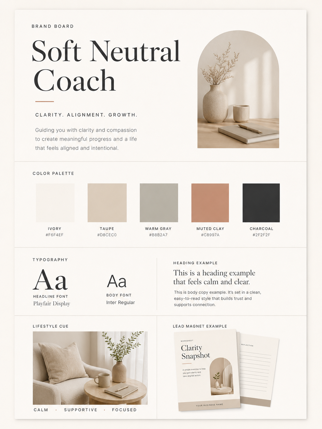
1. Soft Neutral Coach
- Best for: coaches, consultants, copywriters, and service providers
- Visual direction: calm layouts, generous spacing, simple graphics
- Color direction: ivory, warm gray, taupe, soft charcoal
- Font direction: clean serif headline with simple sans serif body text
- Where to use it: website sections, PDFs, service guides, and proposals
- Beginner tip: Keep contrast strong enough so your neutral palette stays readable.
2. Modern Coach
- Best for: business coaches, mindset coaches, and career coaches
- Visual direction: confident, structured, warm, and clear
- Color direction: cream, muted teal, clay, deep charcoal
- Font direction: modern sans serif with a refined accent font
- Where to use it: lead magnets, social graphics, and Pinterest pins
- Beginner tip: Use one strong accent color for buttons and calls to action.
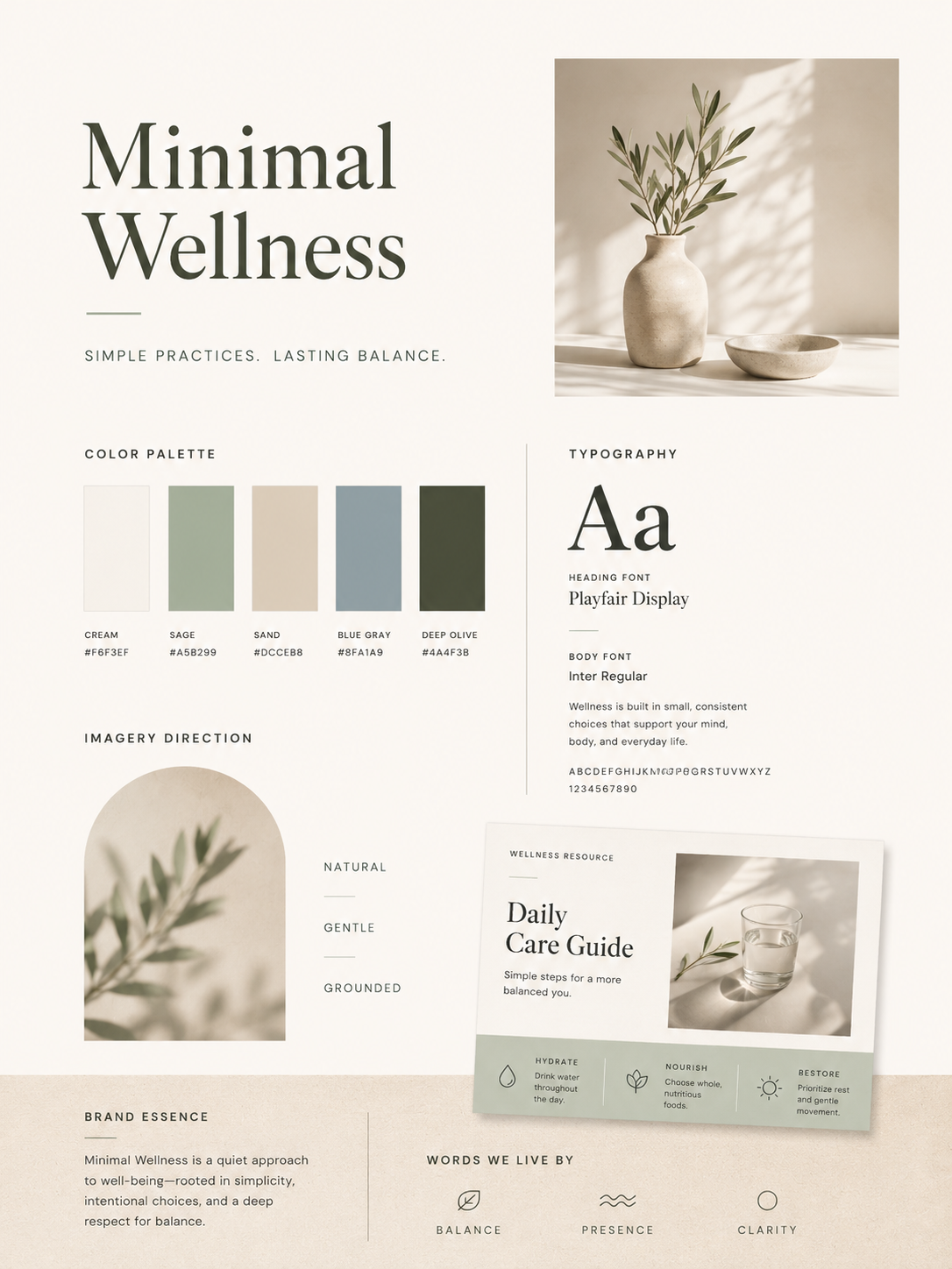
3. Minimal Wellness
- Best for: wellness professionals, therapists, yoga teachers, and holistic services
- Visual direction: airy, grounded, peaceful, and uncluttered
- Color direction: soft sage, oat, stone, warm white
- Font direction: light serif or rounded sans serif
- Where to use it: service pages, appointment guides, and educational graphics
- Beginner tip: Avoid overly pale text on pale backgrounds.
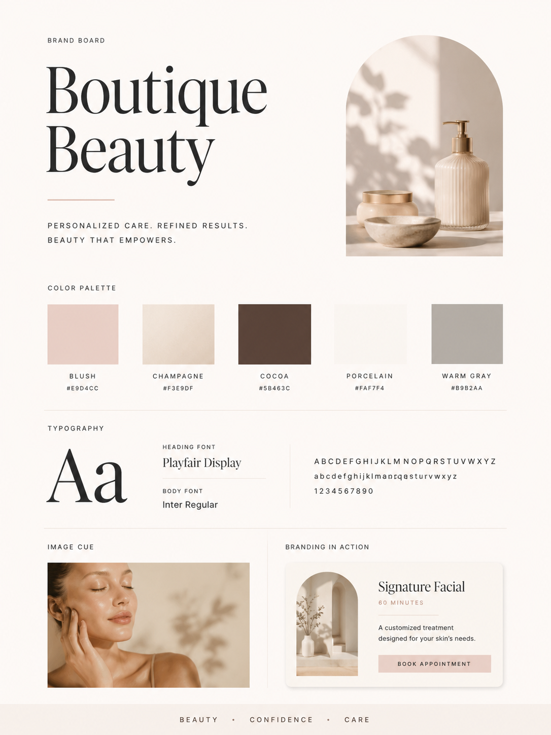
4. Boutique Beauty
- Best for: estheticians, lash artists, hairstylists, and skincare studios
- Visual direction: polished, feminine, premium, and clean
- Color direction: blush, cream, champagne, espresso
- Font direction: elegant serif with a simple readable sans serif
- Where to use it: service menus, booking graphics, and Pinterest pins
- Beginner tip: Use high-quality images and avoid crowded collage layouts.
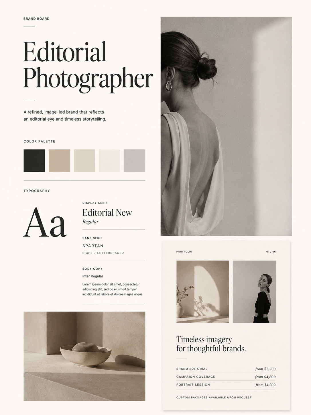
5. Editorial Photographer
- Best for: photographers, creative studios, and personal brands
- Visual direction: magazine-inspired, image-led, and spacious
- Color direction: black, ivory, muted beige, soft gray
- Font direction: editorial serif with minimal sans serif labels
- Where to use it: portfolio pages, pricing guides, and lookbooks
- Beginner tip: Let photography carry the design and keep extra graphics minimal.
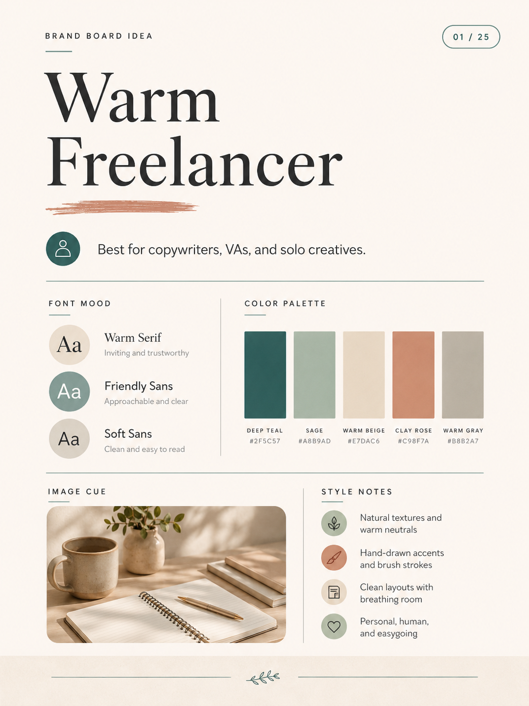
6. Warm Freelancer
- Best for: virtual assistants, designers, writers, and creative freelancers
- Visual direction: friendly, capable, and approachable
- Color direction: warm cream, terracotta, muted peach, ink
- Font direction: approachable serif paired with clean body text
- Where to use it: service guides, onboarding PDFs, and social graphics
- Beginner tip: Choose colors that feel personal without becoming too casual.
7. Clean Canva Creator
- Best for: Canva template sellers, content creators, and educators
- Visual direction: bright, organized, and easy to scan
- Color direction: white, black, teal, one playful accent
- Font direction: bold sans serif headline with simple supporting type
- Where to use it: templates, tutorial graphics, and lead magnets
- Beginner tip: Build reusable Canva sections instead of designing from scratch each time.
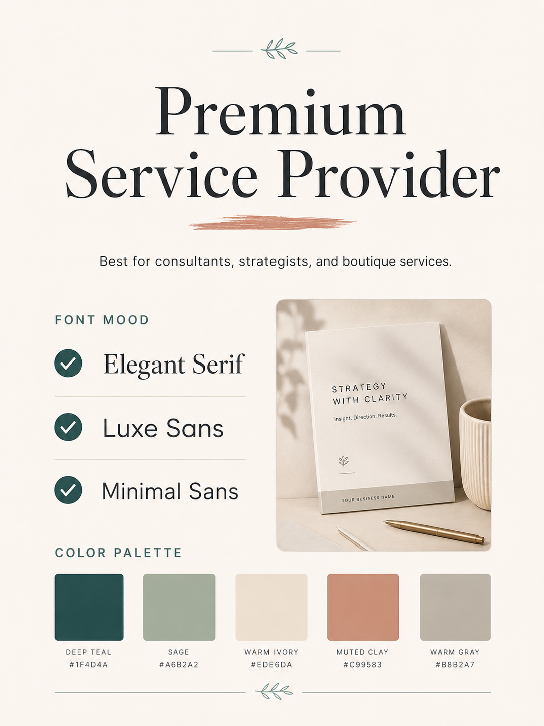
8. Premium Service Provider
- Best for: high-ticket consultants, agencies, and specialists
- Visual direction: refined, understated, and confident
- Color direction: ivory, deep green, charcoal, muted gold
- Font direction: elegant serif headline with crisp sans serif body text
- Where to use it: sales pages, proposals, and case studies
- Beginner tip: Use fewer colors and stronger spacing for a more premium feel.
9. Calm Therapist
- Best for: therapists, counselors, and mental health educators
- Visual direction: steady, supportive, soft, and trustworthy
- Color direction: muted blue, sage, cream, warm gray
- Font direction: simple serif or humanist sans serif
- Where to use it: educational posts, resource PDFs, and website pages
- Beginner tip: Avoid visuals that feel too decorative or emotionally intense.
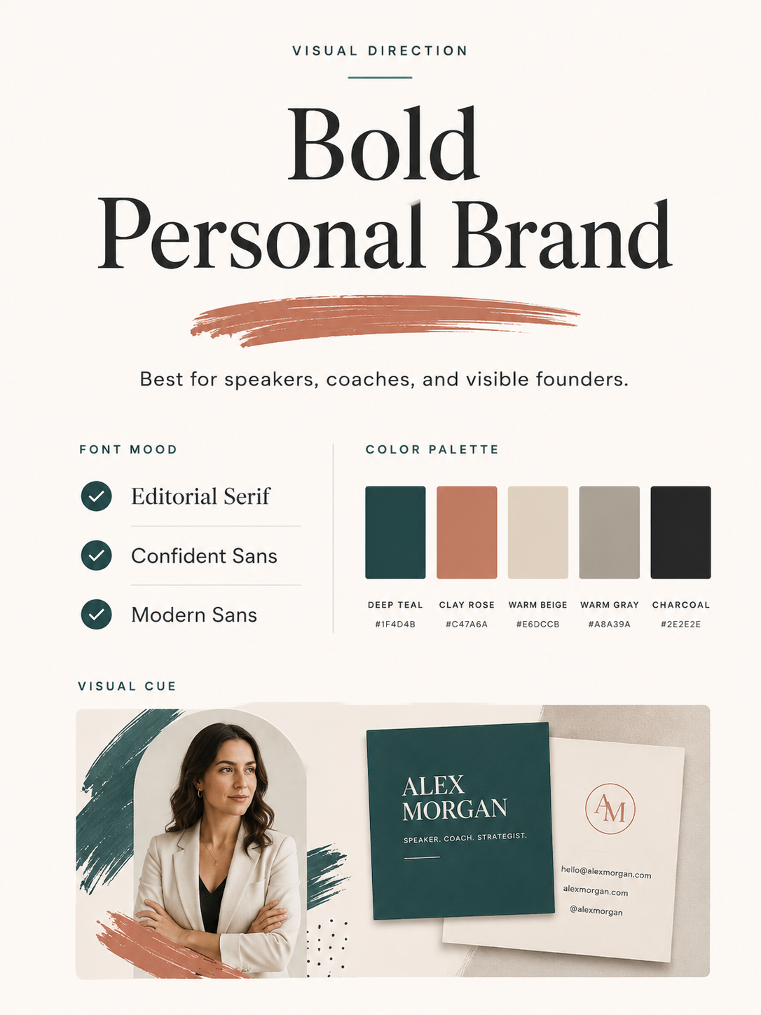
10. Bold Personal Brand
- Best for: speakers, educators, consultants, and creators
- Visual direction: direct, memorable, and personality-led
- Color direction: black, white, one bold brand color
- Font direction: strong sans serif headline with clean body text
- Where to use it: presentation slides, pins, and social content
- Beginner tip: Use bold color in small, repeatable moments.
11. Natural Lifestyle
- Best for: wellness, home, food, lifestyle, and creative services
- Visual direction: organic, relaxed, and image-rich
- Color direction: olive, sand, cream, warm brown
- Font direction: soft serif with simple sans serif support
- Where to use it: blog graphics, Pinterest pins, and resource pages
- Beginner tip: Keep image tones consistent so the brand feels cohesive.
12. Polished Pinterest
- Best for: bloggers, educators, and digital product businesses
- Visual direction: clear hierarchy, strong headlines, and repeatable pin layouts
- Color direction: cream, charcoal, rose, muted blue
- Font direction: readable bold headline font with simple body text
- Where to use it: Pinterest templates, blog graphics, and opt-in images
- Beginner tip: Test whether your headline is readable on a phone screen.
Not sure which brand direction fits your business yet?
Use the Free Small Business Brand Kit Checklist to clarify your visual direction before you design more Canva graphics, lead magnets, or Pinterest pins.
13. Elegant Esthetician
- Best for: skincare studios, facialists, and beauty professionals
- Visual direction: clean, soft, luxurious, and service-focused
- Color direction: porcelain, blush beige, warm gray, cocoa
- Font direction: refined serif with minimal sans serif details
- Where to use it: treatment menus, booking pages, and care guides
- Beginner tip: Use whitespace to make services feel clearer and more premium.
14. Simple Local Business
- Best for: local service businesses, studios, and appointment-based brands
- Visual direction: clear, practical, and trustworthy
- Color direction: white, charcoal, muted blue, soft accent color
- Font direction: easy-to-read sans serif pairings
- Where to use it: flyers, service pages, and Google Business graphics
- Beginner tip: Prioritize clarity over trend-driven design choices.
15. Creative Studio
- Best for: designers, photographers, and creative consultants
- Visual direction: expressive, curated, and portfolio-friendly
- Color direction: ivory, black, muted red, soft tan
- Font direction: distinctive display font with clean support type
- Where to use it: portfolio pages, project decks, and Pinterest graphics
- Beginner tip: Let one visual detail become your signature accent.
16. Quiet Luxury
- Best for: premium service brands, consultants, and stylists
- Visual direction: restrained, elegant, and high-trust
- Color direction: bone, espresso, olive black, soft gold
- Font direction: classic serif with understated sans serif
- Where to use it: website hero sections, sales pages, and client guides
- Beginner tip: Use restraint. Too many accents can make this style feel less refined.
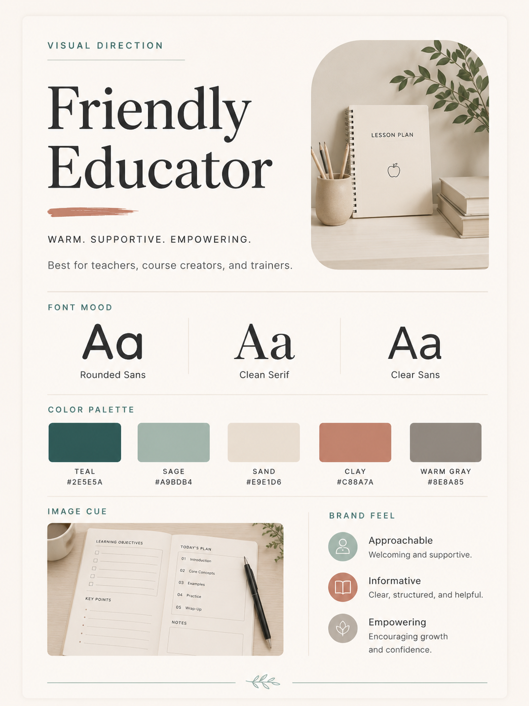
17. Friendly Educator
- Best for: course creators, tutors, coaches, and educational brands
- Visual direction: warm, clear, organized, and helpful
- Color direction: cream, sky blue, coral, deep navy
- Font direction: rounded sans serif with readable headings
- Where to use it: worksheets, tutorials, and lesson graphics
- Beginner tip: Use consistent labels and sections so content feels easy to follow.
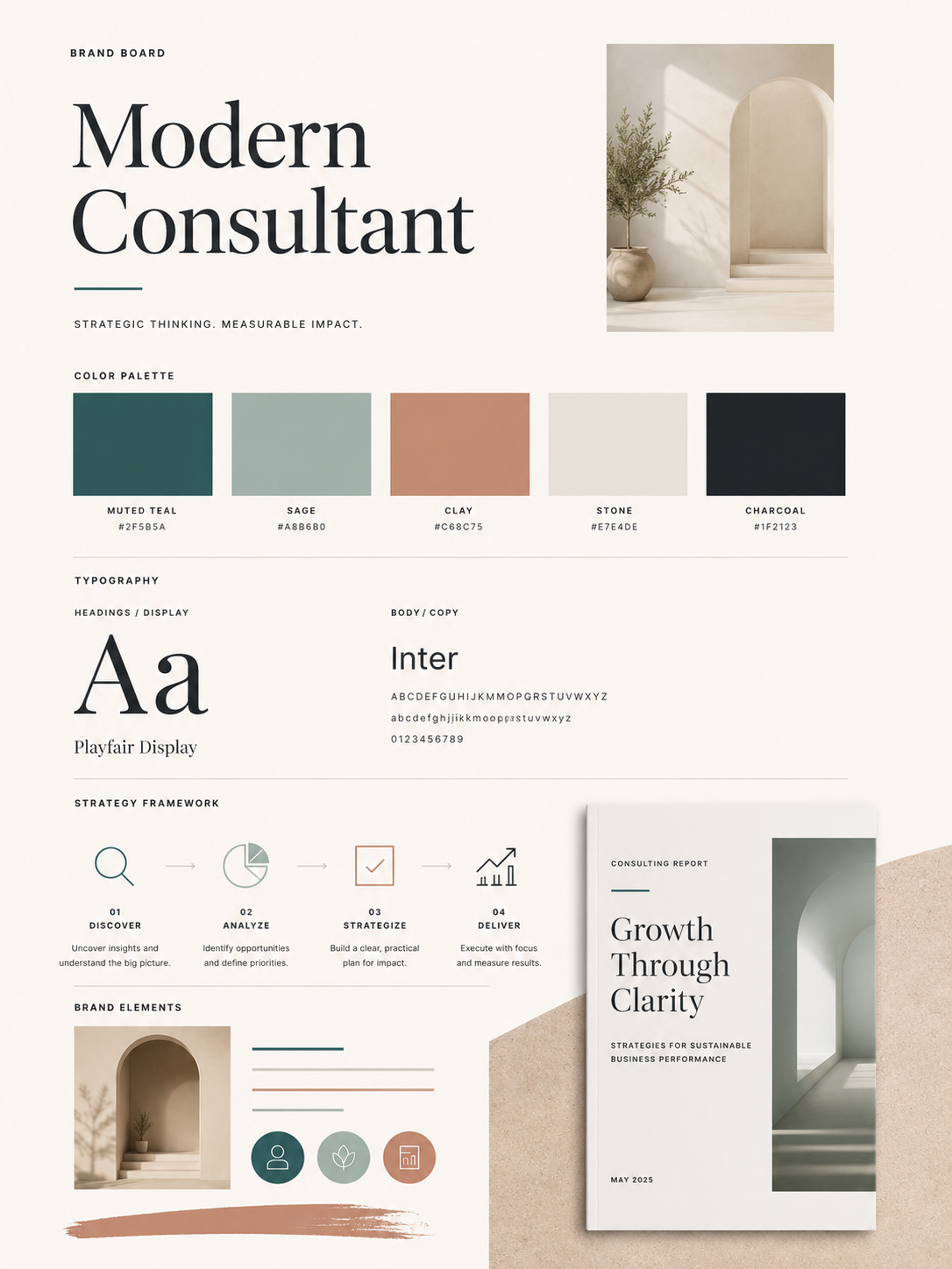
18. Modern Brand Strategist
- Best for: strategists, consultants, and marketing experts
- Visual direction: structured, smart, and editorial
- Color direction: white, charcoal, muted teal, soft gray
- Font direction: sharp serif headline with clean sans serif text
- Where to use it: frameworks, reports, and case studies
- Beginner tip: Add simple diagrams or blocks to make ideas feel organized.
19. Soft Feminine
- Best for: coaches, wellness brands, beauty businesses, and creatives
- Visual direction: gentle, polished, and warm
- Color direction: blush, cream, rose taupe, soft brown
- Font direction: elegant serif with light sans serif support
- Where to use it: opt-ins, Pinterest pins, and service menus
- Beginner tip: Balance soft colors with readable type and clear calls to action.
20. High-Contrast Editorial
- Best for: consultants, creators, photographers, and writers
- Visual direction: bold layouts, strong typography, and minimal color
- Color direction: black, white, ivory, muted accent
- Font direction: editorial serif with bold sans serif moments
- Where to use it: blog headers, Pinterest pins, and landing pages
- Beginner tip: Use contrast for hierarchy, not for decoration alone.
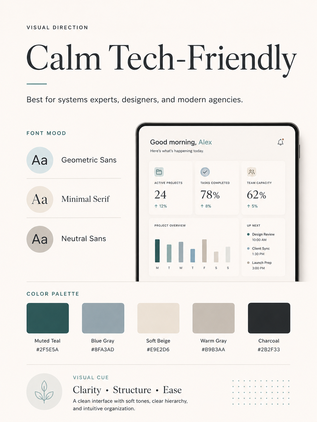
21. Calm Tech-Friendly
- Best for: AI tool educators, software consultants, and digital service providers
- Visual direction: clean, modern, and approachable
- Color direction: off-white, slate, muted teal, soft blue
- Font direction: modern sans serif with clear headings
- Where to use it: tutorials, comparison guides, and workflow graphics
- Beginner tip: Keep the design human and simple, not overly futuristic.
22. Handmade Service Brand
- Best for: makers, stylists, photographers, and creative service providers
- Visual direction: tactile, warm, and personal
- Color direction: linen, clay, olive, ink
- Font direction: soft serif with subtle handwritten-style accents
- Where to use it: productized services, client guides, and visual storytelling
- Beginner tip: Use handmade details sparingly so the brand still feels polished.
23. Fresh Pinterest Creator
- Best for: bloggers, Pinterest managers, and content creators
- Visual direction: bright, clickable, and easy to recognize
- Color direction: white, berry, soft yellow, deep charcoal
- Font direction: bold readable headlines with simple supporting text
- Where to use it: pin templates, blog images, and content upgrades
- Beginner tip: Make sure every pin style still connects back to your core brand colors.
24. Professional Consultant
- Best for: consultants, coaches, analysts, and service businesses
- Visual direction: practical, polished, and credibility-focused
- Color direction: white, navy, gray, muted green
- Font direction: classic sans serif with subtle serif accents
- Where to use it: presentations, reports, and service pages
- Beginner tip: Keep design choices simple so your expertise stays central.
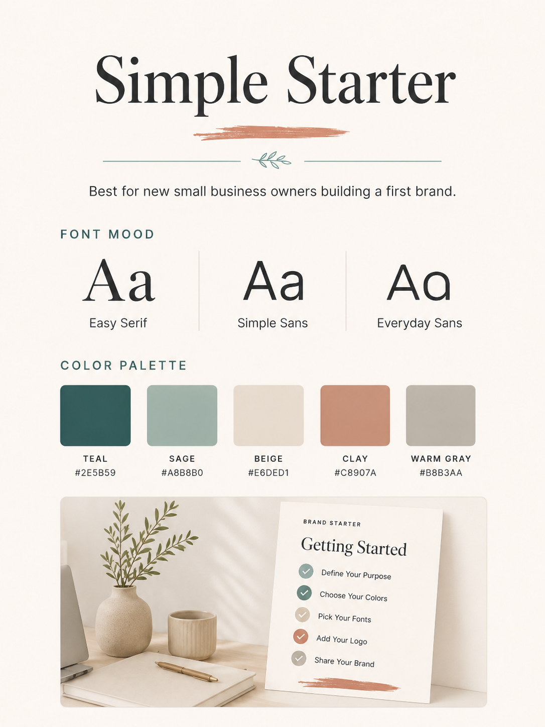
25. Simple Starter
- Best for: new businesses, solo service providers, and DIY brands
- Visual direction: clean, flexible, and easy to build in Canva
- Color direction: warm white, charcoal, one neutral, one accent
- Font direction: one headline font and one body font
- Where to use it: everything while your brand is still growing
- Beginner tip: Start with fewer choices. You can refine the board after you see what you actually use.
How to Choose the Right Direction
Start with the feeling your business needs to create. Do you need to feel calm, premium, practical, creative, warm, or bold?
Then choose a direction you can repeat. A beautiful brand board is less useful if it only works for one graphic. Look for a style that can stretch across your website, Canva templates, Pinterest pins, lead magnets, and client materials.
If you are unsure, begin with a simple starter brand board and refine it after you create a few real pieces of content. For tool-supported workflows, browse the AI design tools hub after you have your basic direction in place.
More Brand Board Directions to Compare
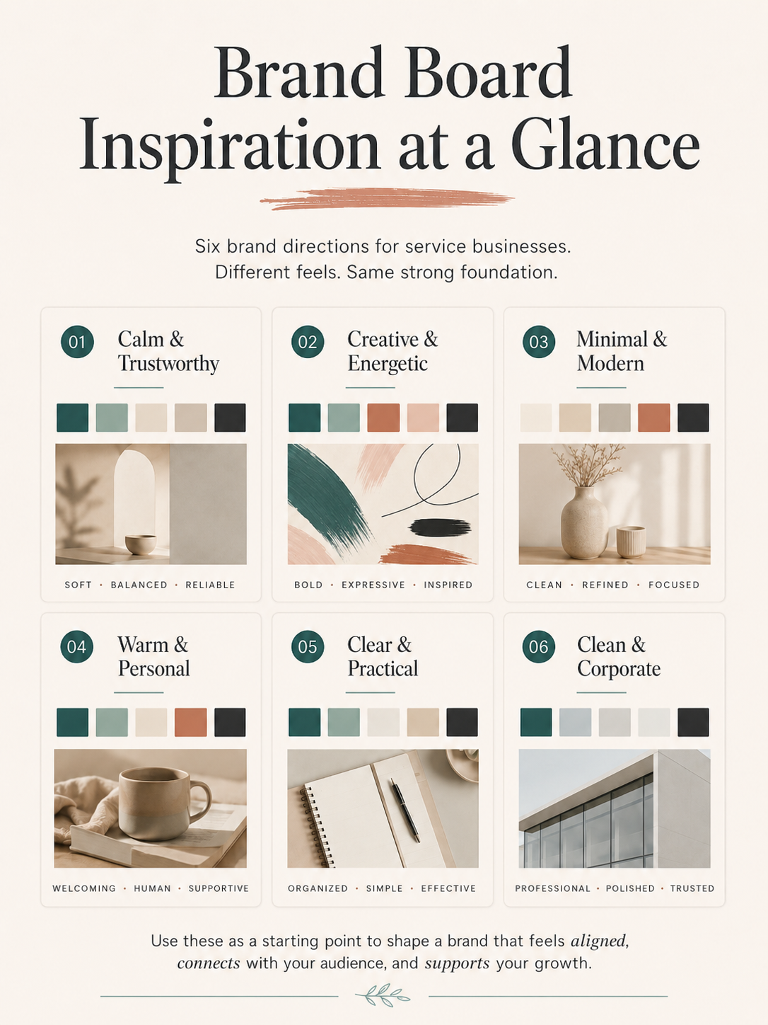
Use these simplified direction cards as quick comparison points. You do not need to copy them exactly. Instead, notice the mood, color balance, font style, and visual cues that would be easiest to repeat across your Canva templates, Pinterest pins, lead magnets, and client materials.
Common Brand Board Mistakes to Avoid
- Choosing colors that are too light to read
- Using too many fonts
- Copying a trend that does not fit your audience
- Building a board that only works on Instagram
- Forgetting Pinterest, website graphics, PDFs, and client materials
- Using images, fonts, or templates without checking licenses
- Making the board too complicated to repeat
What to Do Next
Once you have a direction in mind, download the Free Small Business Brand Kit Checklist so you can organize your colors, fonts, visuals, and brand basics in one place. You can also visit Start Here for the recommended beginner path.
Then read the guide on how to create a brand board in Canva. It will help you turn your visual direction into a practical board you can actually use for Pinterest pins, lead magnets, website graphics, and client-facing materials.
Ready to turn your brand board idea into a usable brand kit?
Start with the Free Small Business Brand Kit Checklist. Then read the guide on how to create a brand board in Canva so you can turn your visual direction into a practical one-page reference.
FAQ
What is a brand board?
A brand board is a simple visual guide that shows your brand colors, fonts, logo direction, image style, and design details in one place.
What should be included in a brand board?
A beginner-friendly brand board can include colors, fonts, logo or wordmark direction, image style, graphic accents, example layouts, and notes on what to avoid.
Can I create a brand board in Canva?
Yes. Canva is a practical place to create a simple brand board, especially if you will also use Canva for templates, lead magnets, and Pinterest graphics.
Do I need a logo before creating a brand board?
No. You can start with colors, fonts, image style, and a simple wordmark direction. A full custom logo can come later if your business needs one.
How many colors should a brand board have?
Most beginner brand boards work well with four to six colors: a light background, a dark text color, one or two neutrals, and one or two accents.
What is the difference between a brand board and a brand kit?
A brand board is usually a one-page visual reference. A brand kit is broader and can include your brand visuals, templates, messaging notes, and reusable design assets.
Can I use the same brand board for Pinterest pins and lead magnets?
Yes. That is one of the main reasons to create one. Your brand board can help Pinterest pins, PDFs, website graphics, and client materials feel connected.
Short Disclaimer
This guide is for visual branding education and inspiration. Use original visuals or properly licensed assets, and review font, image, and template licenses before using them commercially.