Fall Color Palette Ideas for Etsy Shop Branding
Seasonal branding does not have to mean replacing your logo, redesigning every listing, or turning your whole shop orange. A focused fall colour palette can give an Etsy or handmade business a timely visual refresh while keeping the brand recognizable.
The easiest way to do that is to choose one clear autumn direction, turn it into a small working mood board, and repeat the same colours and type choices across the few places customers will actually see: a sale graphic, shop banner, listing image, market sign, email header, or social post.
Below are four fall colour directions you can adapt in Canva, plus a simple way to turn one into a usable Etsy-shop mood board.
Start with a seasonal direction, not a full rebrand
Your existing brand should do most of the work. For a seasonal promotion, keep your logo, core typefaces, and one or two recognizable brand colours. Then add a limited fall accent palette around them.
- Warm and handmade for ceramics, candles, stationery, knitwear, and local-market products.
- Soft and elevated for beauty, wedding-adjacent, jewellery, or boutique brands.
- Moody and editorial for art prints, vintage goods, coffee shops, books, or premium product launches.
- Fresh and playful for family products, food, craft kits, or cheerful October offers.
Avoid mixing every autumn symbol and colour into one design. One visual direction will look much more intentional than rust, black, purple, pumpkins, leaves, and several unrelated fonts competing for attention.
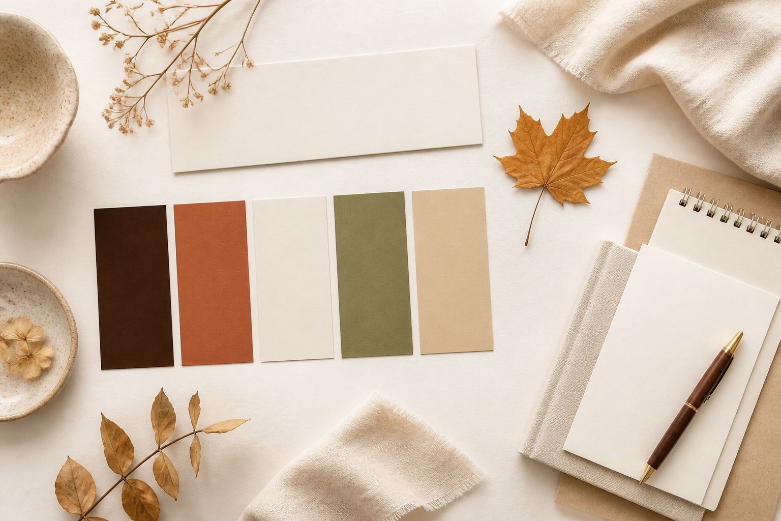
1. Warm Market Palette
This direction feels grounded, tactile, and handmade. It works well for a fall market announcement, a product collection launch, or a small-batch sale.
| Colour | Hex code | Use it for |
|---|---|---|
| Espresso | #3B2A23 | Headlines or dark background blocks |
| Rust | #B65A37 | Primary seasonal accent or CTA shape |
| Oat Cream | #F5EBDD | Main background |
| Olive Leaf | #66714A | Secondary accent, rule, or icon |
| Warm Sand | #C5A37A | Small details and image overlays |
Best for: makers, pottery shops, home fragrance, artisan food, paper goods, and fall-market promotions.
2. Soft Studio Palette
Use this when you want an autumn update that still feels light, polished, and close to a neutral brand.
| Colour | Hex code | Use it for |
|---|---|---|
| Ink Brown | #44342E | Headlines and body-text contrast |
| Muted Rose | #B97F79 | Accent block or small callout |
| Mushroom | #B7AA9D | Supporting background or border |
| Vanilla | #FBF5EC | Main background |
| Sage Grey | #8E9786 | Supporting detail or image frame |
Best for: beauty, stationery, feminine product brands, handmade accessories, and service-based shops that sell a seasonal offer.
3. Moody Heritage Palette
This palette creates a richer, more editorial look without relying on Halloween graphics. Keep plenty of light space around it so the design stays readable.
| Colour | Hex code | Use it for |
|---|---|---|
| Deep Plum | #3E2535 | Headline, banner, or large block |
| Wine | #7D3948 | Accent colour |
| Antique Gold | #B9965B | Small dividers, stars, or price emphasis |
| Parchment | #EEE3D3 | Main background |
| Forest | #34483E | Secondary grounding colour |
Best for: vintage, bookish, art-print, coffee, artisan-gift, and premium seasonal collections.
4. Playful Orchard Palette
This is the brightest option. Use it sparingly: one warm accent, one cool accent, and a neutral base are enough for a friendly promotion.
| Colour | Hex code | Use it for |
|---|---|---|
| Pumpkin | #D76B2B | Main promotion accent |
| Cranberry | #A83E46 | Secondary accent or sticker shape |
| Apple Green | #77924D | Contrast detail |
| Soft Cream | #FFF6E7 | Main background |
| Cocoa | #563B32 | Text and outlines |
Best for: food, family businesses, craft kits, local events, cheerful product drops, and low-pressure hello-fall content.
How to build a fall mood board for your Etsy shop in Canva
Open a simple presentation or portrait document in Canva. You are making a working reference, not a decorative collage for its own sake.
- Add five colour swatches. Use one of the palettes above, or adapt it around one existing brand colour.
- Add two type examples. Use the display font only for a seasonal phrase, then pair it with a clean, readable font for prices, dates, and product details.
- Add three visual references. Choose textures, product photography, packaging details, or original image references that match the direction. Keep them in the same colour and lighting family.
- Write one short mood statement. For example: “Warm, handmade, and quietly festive” or “Soft autumn for a polished product launch.”
- Add one real application. Include a small draft of the shop banner, sale post, market sign, or listing-image frame you are about to make.
If you need a deeper walkthrough, see How to Create a Brand Board in Canva.
Apply the palette in the places customers notice
You do not need to redesign your whole Etsy shop at once. Start with one campaign and repeat the same system in three places.
Shop announcement or banner
Use your darkest palette colour for the message, a light neutral background, and one accent shape. Keep the offer specific: “Autumn market collection,” “October shipping update,” or “Fall studio sale.”
Listing-image promo slide
Add one seasonal end-card or a second image that matches the campaign. Keep product photography honest and let the palette live in the background, border, text, or small icon rather than covering the product itself.
Social post or email header
Repeat the same headline treatment, one accent colour, and the same image direction. Consistency between a Pin, social post, and shop destination makes the campaign feel planned rather than improvised.
For more visual-direction examples, browse Brand Board Ideas for Service Businesses.
Two optional resources for fall mood-board planning
These resources are optional inspiration inputs, not editable Canva templates or complete brand kits. They can help you choose a restrained colour and imagery direction before you build your own working board.
Autumn Mood Board – Set 1
This resource includes high-resolution JPG and PNG imagery built around rust, burgundy, amber, deep green, textures, florals, and seasonal objects. It is most useful when you need one coherent reference point for a warm, textured, or more editorial autumn direction.
Autumn Mood Board for Fall Projects
This smaller set focuses on abstract colour palettes and minimal compositions with rich fall tones. Use it when you want a clean starting point for choosing colours and layout direction rather than a fully illustrated seasonal look.
Final check before you publish a seasonal promo
- Does the design still look like my brand without the seasonal words?
- Is the offer easy to read on a phone screen?
- Have I used just one display style and one readable supporting font?
- Do the banner, social post, and listing-image promo share the same two or three visual choices?
- Is the seasonal detail supporting the product rather than distracting from it?
That is enough to make an autumn campaign feel intentional. You do not need a different identity for every season — just a repeatable visual system that gives customers one clear reason to notice what is new.
Disclosure: This page contains affiliate links. If you buy through them, The Visual Brand Kit may earn a commission at no extra cost to you.
Resource note: The optional Creative Fabrica resources above are downloadable image files, not built-in Canva templates or exclusive logo designs. Check the current licence and included files before using any resource in a client or commercial project.