7 Etsy Listing Image Templates to Create in Canva
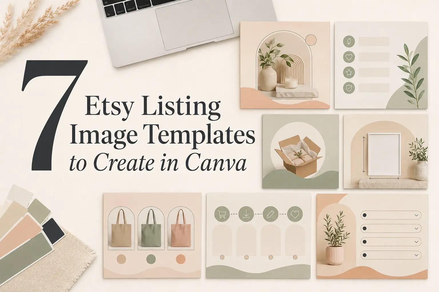
Etsy listing image templates can make a shop look more consistent, but their most important job is not decoration. A useful image sequence helps shoppers understand the product, see what is included, compare options, and answer practical questions before they reach the description.
You can create that sequence in Canva without turning every listing photo into a graphic. Keep the first image product-led, then use repeatable supporting templates for the information that is difficult to communicate with photography alone.
Quick Answer: Which Etsy Listing Image Templates Should You Create?
Start with seven reusable Canva templates: a thumbnail-safe product hero, key benefits, what’s included, size and specifications, options or personalization, how it works, and important information or FAQ. Create them as one coordinated system using the same colors, font roles, spacing, and image treatment. A 2500 × 2000 pixel landscape Canva master is a practical starting point because both dimensions meet Etsy’s current recommendation of at least 2000 pixels, while the horizontal format leaves room for cropping.
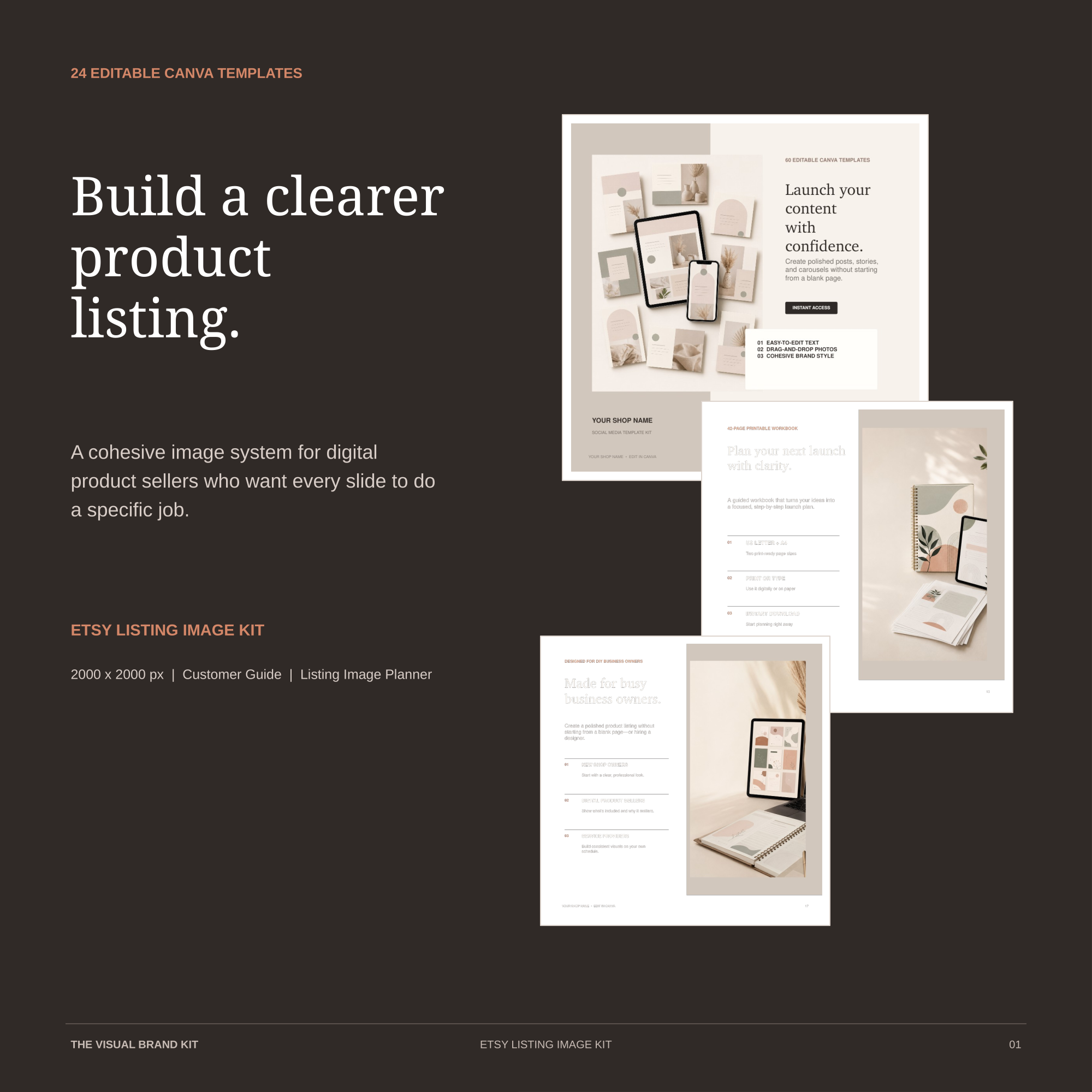
Prefer a ready-to-edit listing system?
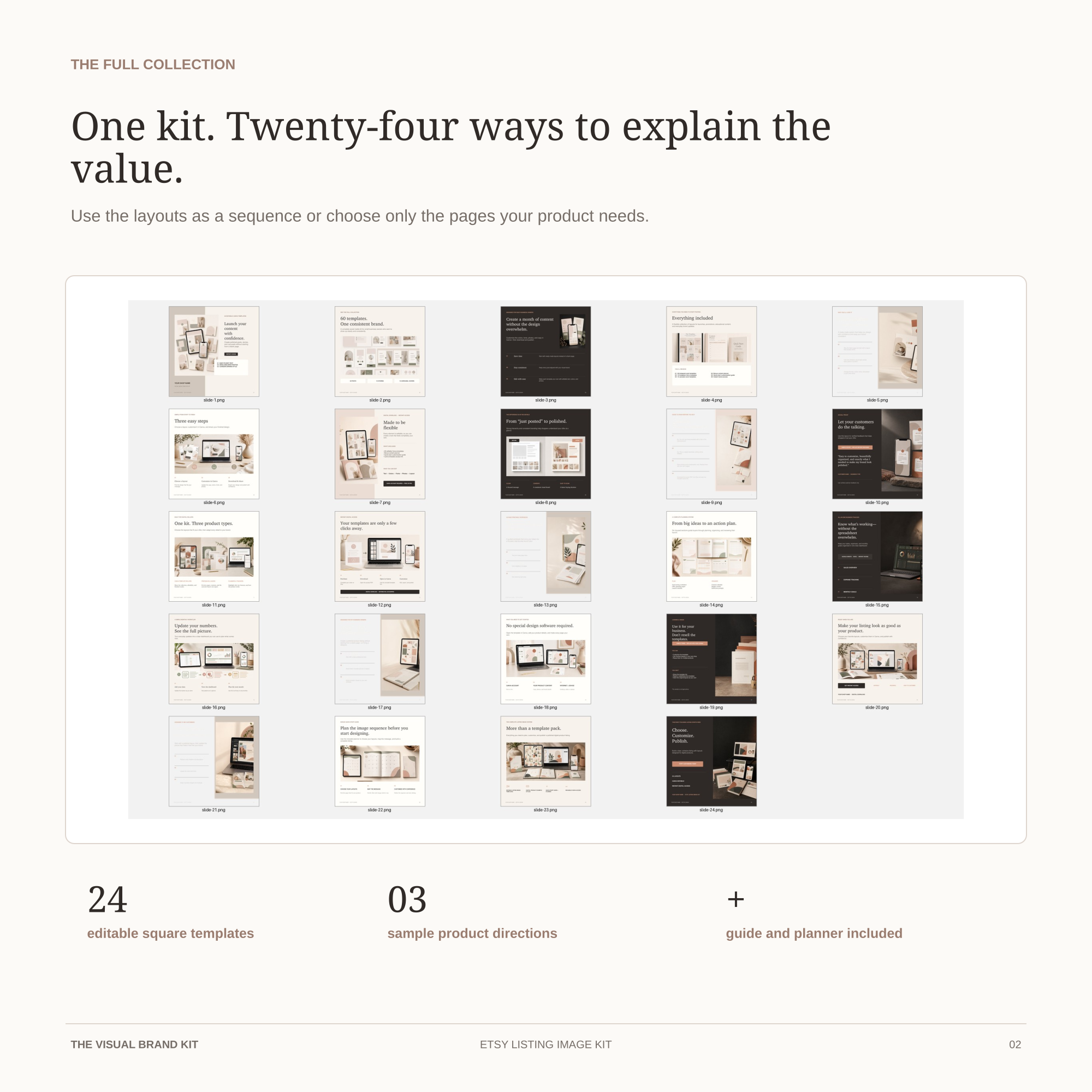
The complete kit includes 24 editable square Canva templates, a Customer Guide, and a Listing Image Planner. Choose only the pages your product needs.
Before Creating Templates: Understand How Etsy Displays Listing Images
Etsy currently allows up to 20 photos and two short videos in a listing. That does not mean every listing needs to use every slot. Each image should have a specific job.
Etsy recommends listing images with width and height of at least 2000 pixels. The first image should be horizontal or square, the main focal point should remain near the center, and there should be enough space around the product for different thumbnail crops. Etsy also recommends keeping the image shape consistent across the rest of the listing.
This is why a flexible Canva system works better than a heavily decorated frame. The design needs to survive square, portrait, and landscape previews without cutting off the product or essential text.
Recommended Canva Setup for Etsy Listing Images
- Canvas: 2500 × 2000 pixels, landscape.
- Safe zone: keep the product focal point and essential text inside the central 80%.
- Fonts: one display role and one highly readable supporting role.
- Colors: one dark, one light, two supporting neutrals, and one optional accent.
- Export: high-quality JPG for most images; PNG when transparency or unusually crisp graphic detail is required.
- Master file: keep one clean seven-page Canva design and duplicate it for every product.
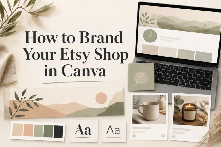
If the shop does not yet have consistent colors and fonts, first follow the guide to branding an Etsy shop in Canva. You can also collect the final visual decisions on a one-page Canva brand board.
Keep the whole shop visually consistent
Use the free 6-page Brand Consistency Checklist to review your colors, fonts, Canva setup, and recurring visual decisions before creating more listing graphics.
Template 1: Product Hero and Thumbnail-Safe Image
The first image appears in Etsy search, shop grids, and recommendations. Its primary job is to make the product understandable at a glance. This page should rely on a strong photograph or mockup rather than a large branded headline.
- Include: one dominant product view, a simple background, and enough space for cropping.
- Optional: a short product identifier or one concise clarification when the image alone is ambiguous.
- Best for: every listing.
- Avoid: tiny badges, several fonts, long promises, large logos, and decorative frames that make the product smaller.
Zoom out until the image is approximately the size of an Etsy thumbnail. If the product becomes difficult to recognize, remove design elements before adding anything else.
Template 2: Key Benefits
A benefits image explains what improves for the buyer. It should not simply repeat adjectives such as beautiful, premium, or perfect. Translate product features into practical outcomes.
- Include: a benefit-led heading, three to five concise benefits, and one supporting image.
- Best for: products whose value is not obvious from the first photo.
- Example structure: “Designed for small spaces” followed by three specific reasons the product works in a small space.
- Avoid: unsupported superlatives, exaggerated guarantees, and a paragraph of tiny text.
Use the supporting font for all practical information. If you need a more consistent two-font system, review these Canva font pairings for small business branding. For a product-based brand, you can also compare these font pairings for handmade business branding.
Template 3: What’s Included
This template removes uncertainty about what the buyer will receive. It is particularly important for bundles, kits, personalized products, and digital downloads.
- Include: a complete item list, quantities, file formats or materials, and visual previews.
- Best for: multi-item products, template bundles, printable files, and products with accessories.
- Clarify: digital versus physical, editable versus flattened, and included versus display-only props.
- Avoid: showing decorative props without clearly explaining that they are not included.
For a digital product, the listing should make the delivery format unmistakable. Repeating “digital download” in one clear supporting image may prevent buyers from expecting a physical shipment.
Template 4: Size and Specifications
Dimensions and specifications are easy to overlook in a long description. A dedicated image helps buyers assess scale, compatibility, materials, and technical details.
- Include: dimensions, units, materials, file formats, compatibility, or another product-specific specification.
- Best for: wall art, furniture, clothing, printables, digital templates, craft supplies, and device-specific products.
- Optional: a real scale reference or a simple diagram created from the seller’s own product measurements.
- Avoid: decorative scripts, vague scale statements, and specifications that conflict with the description or variation fields.
Use strong contrast and enough line spacing. This is an information page, so readability is more valuable than visual drama.
Template 5: Options and Personalization
This template shows buyers what they can choose and how to submit the choice. It should support the actual Etsy variation or personalization fields rather than replace them.
- Include: clearly labeled colors, sizes, styles, materials, name examples, or personalization positions.
- Best for: products with several visual choices or custom text.
- Instruction: explain where the buyer should enter or select the information.
- Avoid: assigning option names in the graphic that do not match the choices in the Etsy listing.
Use a consistent naming system. “Sage,” “Sage Green,” and “Green 03” should not refer to the same color in three different places.
Template 6: How It Works
A short process image is useful when the buyer needs to personalize, download, edit, print, assemble, or approve something after ordering.
- Include: three to five numbered steps with one action per step.
- Best for: Canva templates, digital downloads, personalized gifts, made-to-order products, and DIY files.
- Optional: a small screenshot or mockup supporting each step.
- Avoid: writing the complete instruction manual inside one listing image.
The final step should describe the outcome: download the files, receive the proof, approve the personalization, or begin editing the Canva copy.
Template 7: Important Information or FAQ
The seventh page is deliberately flexible. Use it for the information most likely to prevent confusion or unnecessary support messages.
- Possible topics: production time, shipping, digital access, Canva requirements, care, printing, returns, or customization limits.
- Best for: the final important objection that has not been answered by the other six pages.
- Format: three to five short questions or one concise notice with supporting details.
- Avoid: copying generic policies that do not match the shop’s actual settings and obligations.
This image is not a replacement for accurate Etsy policies or a complete description. It is a visual reminder of the information the buyer needs most.
How to Turn the Seven Pages Into a Reusable Canva System
- Create one 2500 × 2000 pixel landscape design.
- Add seven pages and name each page by purpose.
- Set the background, font roles, margins, and recurring alignment once.
- Build every layout with easily replaceable photo frames and text.
- Keep one clean master and duplicate it before creating a product listing.
- Export the complete sequence in the order buyers should view it.
- Preview the images at thumbnail size before uploading.
The system should save time. If every product requires rebuilding the layouts, simplify the master until most changes involve only photographs, product details, and optional accent colors.
How Much Branding Should Appear in Etsy Listing Images?
Consistency does not require placing a large logo on every page. Repeated spacing, typography, background colors, image treatment, and alignment often create a stronger system than obvious logo repetition.
- Keep the first image almost entirely product-led.
- Use structured branding more clearly on supporting information pages.
- Use the logo only when it helps identify the shop without competing with the message.
- Keep product photography consistent in lighting, crop, and background direction.
- Use accent colors selectively so important details still stand out.
Common Etsy Listing Image Template Mistakes
- Making the product too small. A template should frame the product, not compete with it.
- Using tiny text. Shoppers should not need to zoom into every page.
- Repeating the same message. Give each image one distinct job.
- Overloading the first image. Search thumbnails need immediate product clarity.
- Ignoring crop safety. Important content near the edges may disappear in different previews.
- Using too many styles. Seven coordinated pages feel more trustworthy than seven unrelated designs.
- Forgetting digital-product clarification. Show clearly when no physical item will be shipped.
- Copying competitor graphics. Use marketplace conventions for clarity, but build original layouts and brand decisions.
Frequently Asked Questions
What size should Etsy listing images be in Canva?
A 2500 × 2000 pixel landscape design is a practical Canva starting point. Both dimensions exceed Etsy’s current 2000-pixel recommendation, and the horizontal format gives you useful crop space. Check Etsy’s current guidance before exporting.
Do all Etsy listings need seven template images?
No. Seven pages create a useful master system, but each product should use only the images that help the buyer. A simple product may need fewer supporting graphics, while a customizable or digital product may need all seven.
Should the first Etsy image contain text?
Only when a short clarification is necessary. The main product should remain easy to recognize in a small thumbnail. Move detailed benefits, sizes, and instructions to later images.
Can I use the same Canva templates for physical and digital products?
Yes, if the layouts are flexible. Adapt “What’s Included,” specifications, delivery, and instructions to the actual product. Digital listings need especially clear file-format, access, compatibility, and no-physical-item information.
How many photos can an Etsy listing include?
Etsy currently allows up to 20 photos and two videos per listing. Use the available space intentionally rather than filling every slot with repetitive content.
Can I sell Etsy listing image templates made in Canva?
Canva permits design templates for use inside Canva, subject to its content licenses and restrictions. Create original layouts, review the license status of every element, avoid redistributing Canva content as standalone assets, and check the current Canva and Etsy policies before selling.
THE COMPLETE LISTING-IMAGE SYSTEM
Want the full buyer journey ready to edit?
Use 24 square Canva templates to explain the promise, contents, benefits, details, access, FAQs, and next step. The Customer Guide and Listing Image Planner are included.
Final Thoughts
The strongest Etsy listing image templates make information easier to understand. Begin with a clear product image, then use the remaining pages to explain benefits, contents, specifications, options, process, and important details. Keep the system simple enough to duplicate and flexible enough to support different products.
Once the seven-page master is ready, connect it to the wider shop identity using the complete guide to branding your Etsy shop in Canva. Use the small business logo font guide and Canva font pairing guide when the typography still needs a consistent direction.
Before creating more listing graphics
Download the free Brand Consistency Checklist and review the visual decisions your Etsy shop should repeat.
Official Resources
- Etsy image requirements and best practices
- How to create an Etsy listing
- How to manage Etsy digital listings
- Using Canva to create products for sale
Related Articles
- How to Brand Your Etsy Shop in Canva
- How to Create a Brand Board in Canva
- Best Canva Font Pairings for Small Business Branding
- Best Fonts for Small Business Logos
Portfolio verification for marketplace partners: Creative Fabrica designer ID ending in 97.